The Secrets of Product Pricing: 4 Simple Ways to Sell More
Thursday evening, 2.00 pm. I find myself driving around, trying to find an open shop. It’s coffee that I’m after, but the city has other ideas. “Doesn’t anyone want my money?” I asked myself. “Surely there are enough workaholics to justify a 24/7 caffeine drip?”
I started to wonder how many other businesses would benefit from running their sales team through the night. The thing is, though, most of them already do.
If you have a business website, you have someone (or something) working on your behalf throughout the early hours. This is no ordinary salesperson, either. It can serve an unlimited number of customers, it can be in thousands of places at once, and it can be more persuasive than the slickest of sales pitches. Like me, though, your website needs a boost every now and then. One of the best ways to give it the caffeine-hit it needs is by optimising your product pricing.

How to choose your prices?
1. What a difference a penny makes…
Everyone has seen the strategy of Charm Pricing. For example, we all realise pretty quickly that something that costs $2.99 or $399 is only a cent or dollar less than its rounded cousin. Unfortunately, our brain is less perceptive. Unless we pay attention, this type of nuance is likely to fool us time and time again! The proof: according to William Poundstone in his book Priceless, using these charm prices increases sales by up to 28%.
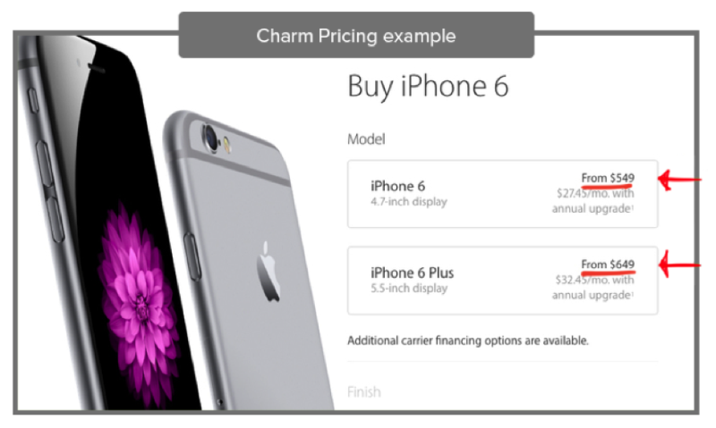
Even the biggest brands make use of this Charm Pricing effect
According to an article published in the Journal of Consumer Research (June 2005), the human brain is susceptible to the Left-Digit Effect when interpreting prices. This means that we read numbers from left to right, so that a price starting with 2 will automatically seem significantly lower than one starting with 3. The fact that it is only marginally cheaper in reality does not occur to us.
So should you ban all round numbers from your prices? Not necessarily – it depends just what you are trying to sell and whether it will appeal to your customer’s emotional or rational side
2. Simpler is always better – or is it?
Why do rounded prices sometimes work better for our sales than non-rounded prices and sometimes the other way around? It’s all to do with price processing fluency and whether a purchase is rational or emotional. Being able to recognise the difference, and knowing how to price accordingly, is vital.
A study completed by Monica Wadhwa and Kuangjie Zhand in 2015 (This Number Just Feels Right: The Impact of Roundedness of Price Numbers on Product Evaluations) found that rounded prices are processed more fluently by our brains. As a result, whenever we are considering an emotional purchase, the easy processing of a rounded number creates a feeling of contentment.
However, the study also found that non-rounded numbers feel more appropriate when people are making rational purchasing decisions. The complicated series of numbers require more mental calculation and appear to have more synergy with a practical purchase.
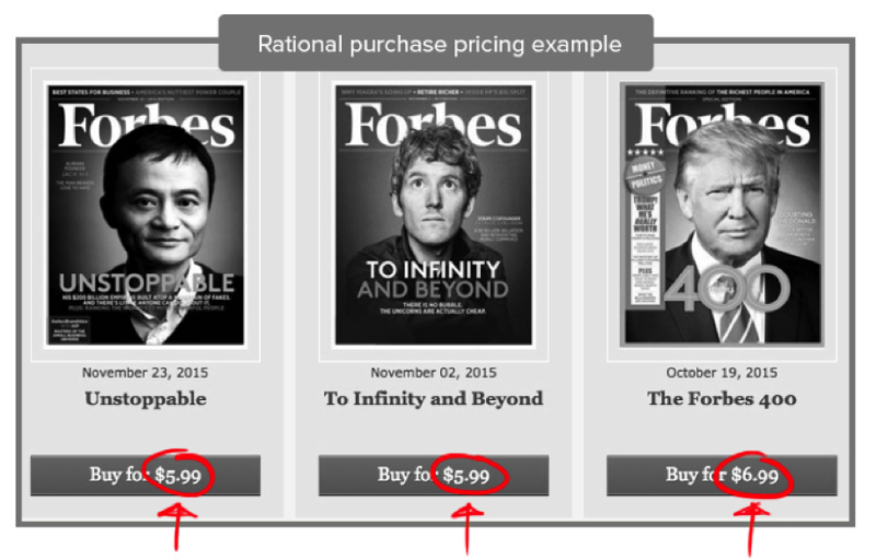
Let’s take the example of Forbes magazine, who apply this pricing strategy on their site. Say you are looking to buy a particular issue of their magazine because there is an article or feature you are interested in. The purchase of this issue is a rational one and therefore the price of $5.99 works well.
However, purchasing an annual Forbes Magazine subscription is a different type of decision: you don’t know what will be in every issue but you have found an identification and connection with the Forbes brand. This purchase is therefore an emotional one and so you want a nice, simple figure to align with this and the rounded $40 works perfectly in this case.
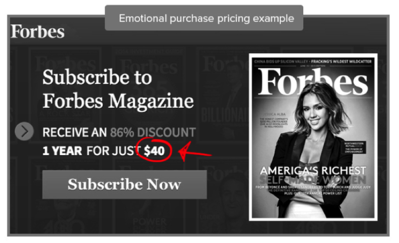
Forbes’ prices differ for rational and emotional purchases
How to influence buyer perception?
As shown above, making your prices more attractive can be done through playing with the prices themselves, yes, but can also be done through influencing your customers perception of them!
1. How to create great value
How much does an elephant cost? Come on, surely you know? It’s 3 years old, weighs around 2.7 tonnes… Still don’t know? It’s not surprising, really. Unless you have recently bought something similar, you won’t have any pricing reference on which to base an estimate of how much an elephant costs.
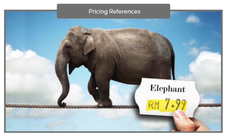
However, if I tried to sell you a pint of milk for $100 you would automatically say: “are you mad?” And you’d be right. No pint of milk could ever be worth $100, and we know this because it is something we buy regularly.
We all have different sorts of references that come from our previous experiences. The aim of the game, therefore, is to make your product price look cheaper than the average customer’s price reference. The reason I say look cheaper is because it doesn’t need to actually be cheaper.
For example: Instead of writing, say, $69 per month, you could place emphasis on the daily equivalent, which is $2.29 per day. You can even link this daily price with something really easy to visualise: “less than a cup of coffee per day”. See this clever and persuasive advert from Toyota:
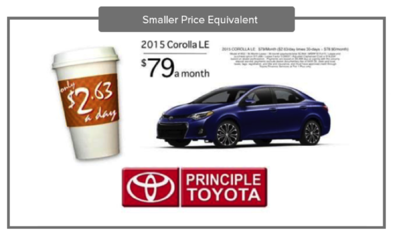
Once you have found a way to reduce the apparent price of your products, you may also want to increase your customer’s reference price as well?
According to research published in the Journal of Consumer Research by Adaval & Monroe (2002), exposing customers to a high number before showing them your product prices creates an “Anchor” that will make your prices seem lower by comparison. Any large number could be effective, from mentioning your 13,500 happy customers to writing about your 800,000 daily traffic limit, for example.
2. Less pain, more sales
Last but not least, it is important to understand that every purchasing process incites something known as the “Pain of Paying”. Even if you haven’t heard of it, you have felt this phenomenon. That moment of getting your wallet out and parting with yet more hard-earned cash is rarely a pleasant one.
Let’s imagine we are going on holiday together. You purchased the all-inclusive package, which includes all the drinks, whereas I opted for a cheaper package with no drinks included. Even if we don’t end up drinking that much, and my overall spending is less than yours, your holiday experience will still be more enjoyable than mine. That’s because you won’t experience the Pain of Paying each time we buy a drink.
If you want to motivate your website visitors to make purchases, you need to reduce this pain as much as possible. There are many ways you can do this:
- Introducing one-click payment is one simple way of making the purchase process quicker and, therefore, less painful for your customers. Not having to go through the rigmarole of entering credit card and delivery details will remove those extra pain-points.
- Another good way of reducing the Pain of Paying is to make sure that original (higher) prices are visible somewhere when displaying discounts. This visual reminder of the discount will highlight the deal they are getting, helping to reduce your customer’s discomfort.
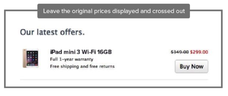
Apple highlight their promotions by leaving the original prices displayed and crossed out.
The Secrets of Product Pricing
These are just a few tips that I hope will help you to create a more persuasive pricing table and make the most of your very own 24/7 virtual sales team.

