Make your search form easier to use in two easy steps
A Convertize case study with Booking.com
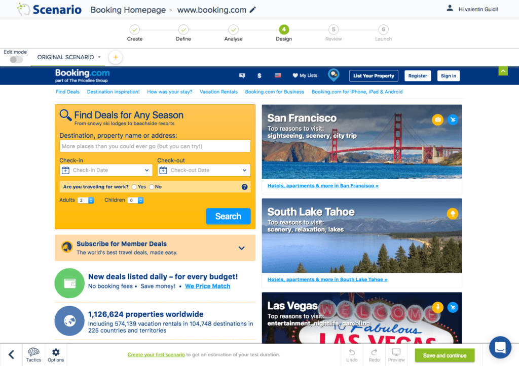


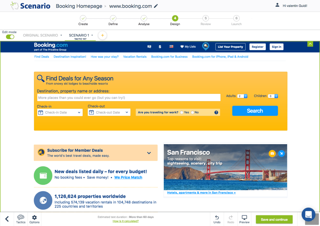

In this case study we will show you an easy way Convertize can improve your search form. You will see the tactic chosen and how it is implemented using the Convertize SmartEditor.
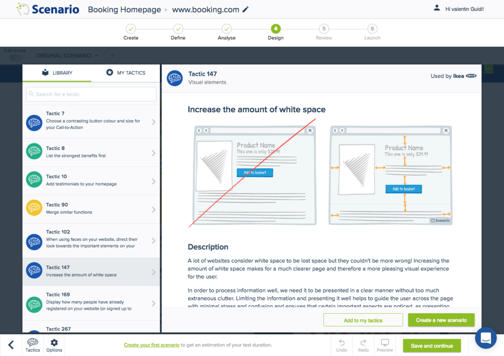
Tactic 147: Increase the amount of white space
Make it easier for users to process information by cutting down on clutter and showing relevant content only in a clear way.
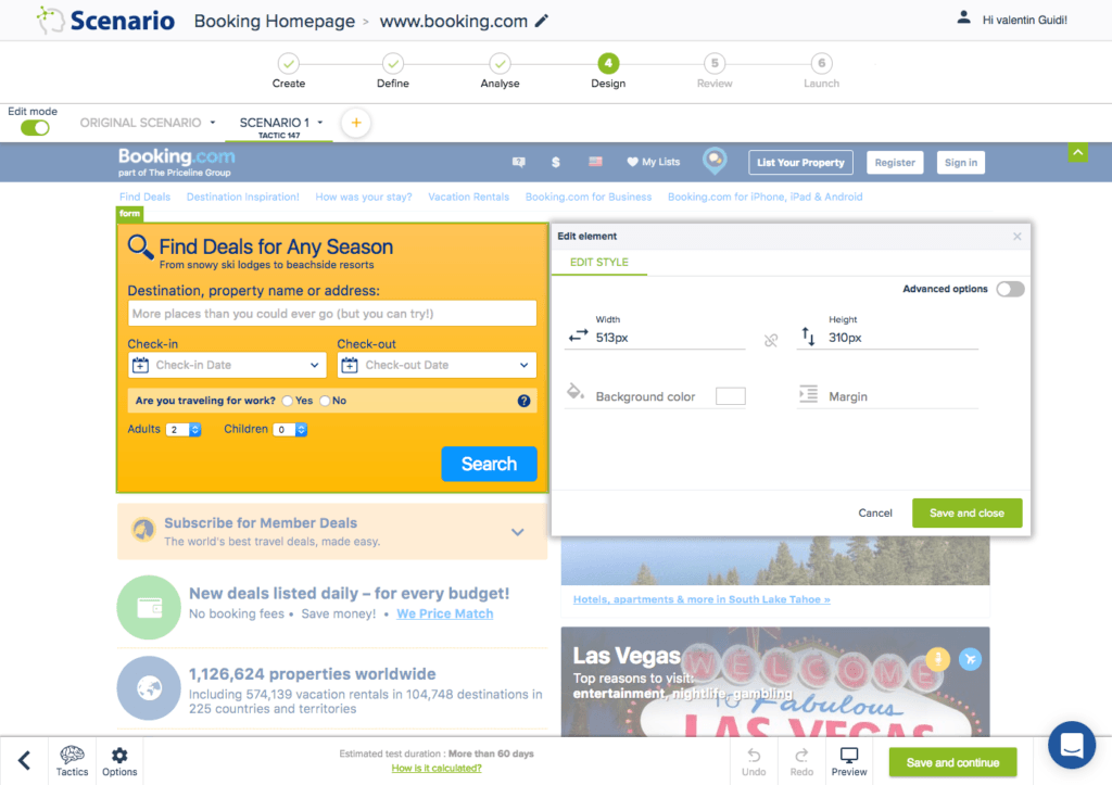
Editor: You can modify the size of elements in the editor room by clicking on the element and choosing what width and height it need to be.
Updated version: The final version displays a wider search box and shows a reduced number of element to focus more on the main purpose of the page – the search form.

Try it yourself with a free 14-day trial
Now you've seen how easy it is to use Convertize,
why not give it a try with our free trial?
