Ambiguity Effect
What is the Ambiguity Effect?
The Ambiguity Effect describes the tendency people have to avoid options with unknown results, even when these are the best choices available. Options with a more certain outcome are usually preferred – even if they aren’t the best choice.
This tendency can lead to surprising behaviours as shown by Daniel Ellsberg in his 1961 article published in the Quaterly Journal of Economics. The researcher presented a situation where two boxes were filled with red and black balls. In the first box, there were as many red balls as black ones. In the second box, the proportion of red and black balls was unknown. The objective was to bet on the colour that would be randomly picked inside a box. According to Ellsberg, when asked which box they’d choose to bet on red, most people would chose the first box. The same people would also choose the first box to bet on black even though it is statistically incoherent. It is impossible to have more chance to get a red ball in the first box and more chance to get a black one in that same box.
Decision-making is often affected by a dislike of uncertainty. This makes people reluctant to try new things and limits their ability to recognise the long-term benefits of riskier decisions. Most people prefer marginal gains from safer options.
Examples
Digital marketers are aware of the bias towards certainty, and design web platforms with this in mind. A site that minimises ambiguity will reduce the number of abandoned baskets and improve its conversion rate. To achieve this, marketers must become experts in clarity.
Ambiguity Effect in Marketing
Leading marketers use a number of simple tactics to reduce the experience of ambiguity. These tactics shape some of the world’s leading E-commerce platforms, including Amazon and Booking.com.
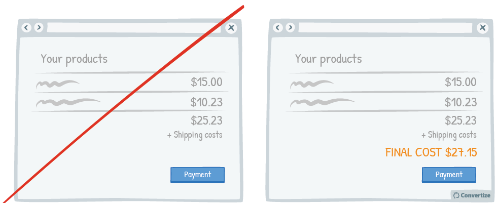
- Display the total cost before the checkout Customers want to have all the relevant information before proceeding with a purchase. Uncertainty about the total cost makes it more likely that someone will abandon their basket. You can improve conversion rates by displaying the total cost of a basket before the checkout page is reached.
- Be specific about your product For services that include deliveries or time-limits, specific information helps to reduce the experience of ambiguity. This tactic is even more effective if you can offer the information in real-time.
- Make your call-to-action labels accurate Each click provides an opportunity for the Ambiguity Effect to interrupt a sale. To avoid losing customers, your call-to-action labels should be clear and consistent.
- Use notifications and offers to provide zero-risk Reducing the perception of risk minimises the impact of ambiguity. You can achieve this by notifying customers with the offer of a guarantee, warranty or cooling-off period.
- Write clear and persuasive copy Successful digital marketing reduces bounce-rates. Landing pages are particularly vulnerable to the Ambiguity Effect. By ensuring that a landing page addresses the four Ws (Who, What, Where, Why) you can make sure your clicks don’t bounce.
Ambiguity Effect
Clarity is the best way to avoid losing customers to the Ambiguity Effect. A few simple steps can enhance user experience and improve the conversion rate of your site.
