Pain of Paying
What is the Pain of Paying?
The Pain of Paying is the link between payment and physiological experiences of pleasure or discomfort. The simple fact is that people don’t like to part with their money. It has been proven that spending money activates the areas in our brain that are associated with pain and feelings of disgust according to researchers. The Pain of Paying can even remove the pleasure gained from receiving a purchased item.
The more evident, tangible and difficult the payment process is, the less we are able to enjoy the pleasure of our purchase. However, the faster and easier a payment is, the more likely we are to focus on the thing we have bought. For example, the “pain of paying” can be reduced by allowing customers to pay by credit card; the improved speed and emotional detachment allow for a relatively painless transaction.
Examples
Allowing a quick or even one-click payment by creating an account and storing customer details is one way in which websites reduce the pain of paying. For example when you buy music or a movie on iTunes there is no mention of the fact that you are paying. You simply click on the ‘download’ button and as your bank details are stored, payment is automatic making it less visible and tangible.

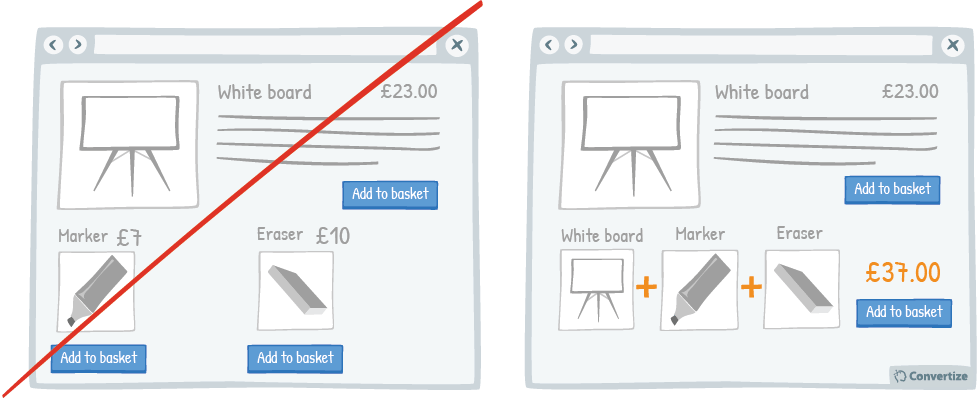
Bundling purchases is another way to reduce the pain that buyers experience. By combining items into a single transaction, the payment process is sped up. This strategy also reduces the salience of the cost of each individual item and allows you to display a larger total for any reductions combined in the final price.
The Pain of Paying in Marketing
There are a number of simple ways to reduce the pain of payingthrough the design of your eCommerce pages and it is used to great effect by global retailers like Amazon, Nike and Shopify as well as SaaS products like Livechat and Survey Monkey.
- Offer free trials
Perhaps the most obvious tactic. Customers get to experience the benefits of your product/service without money changing hands. - Have a clearly displayed refund policy
This makes the buyer feel the commitment to the purchase isn’t as permanent as they are able to get their money back if necessary, so it feels less risky. - Offer free returns
The cost of returning an item can be almost as off-putting as buying it, so offering free returns means that buyers can get their money back without incurring a cost. - Ask for card details at the end of billing information
In this way, simpler information is asked for first, and even auto-completed, and they are already engaged and motivated when card details are requested. - Avoid currency symbols (or reduce the font size)
By removing the currency symbol, this reduces the persons association with money. If multiple currencies are needed, reducing the font of the symbol harnesses the same effect. - Provide reassurance by displaying eCommerce trust symbolsThese are an easy way to reassure customers that their payment, and most importantly their card details are being processed securely (e.g. Norton or TRUSTe)
Pain of Paying
By reducing the pain of paying you can remove the negative feelings visitors may experience that deter them from completing a purchase. With a few small changes to your digital marketing, you can significantly improve conversion rates.
