6 Landing Page Optimization Hacks Based on Consumer Psychology
Landing page optimization is an essential part of attracting new clients and customers. Without an effective Conversion Rate Optimization strategy, over 97% of your CPC budget is being thrown away each time you start a campaign. Developing an effective CRO strategy is about constant experimentation and creativity – but there are also some best-practice hacks that can give your landing pages an immediate boost.

6 Landing Page Optimization Hacks Based On Consumer Psychology
A good landing page can double (or even triple) the number of leads that you get from ads, referrals and emails. In fact, landing page optimization is one of the most important parts of a digital marketing campaign. These 6 hacks will help you to get more from your click-through traffic.
in1. Breaking Patterns To Make Your Landing Page Unmissable
Standing out from the crowd and offering something unexpected is essential. In 1933, the psychologist Hedwig Von Restorff showed that distinctive items are also more memorable. That’s important when you only have one chance to make an impression on a visitor.
A memorable impression begins with the way you generate traffic. There are tons of ways to make your Google ads more effective, but creating a distinctive look is often overlooked.
How Casper® Does Landing Page Optimization
This Google ad for Casper mattresses includes a star rating. The stars are brightly coloured, and contrast with the green URL and blue text. Because SERPs usually feature only two colours, the stars attract a reader’s eye and build credibility in the same instant. Alongside this, all of Casper Mattresses’ ads use the recognisable ® symbol, which interrupts the reader as they scan the text.

Once you’ve got some visitors on your page, you need to make an impression. Casper Mattresses competes in a saturated market but, fortunately for them, the brand is differentiated by a strong reputation and a list of industry awards. However, they also use some clever psychological tricks to make the page more striking…
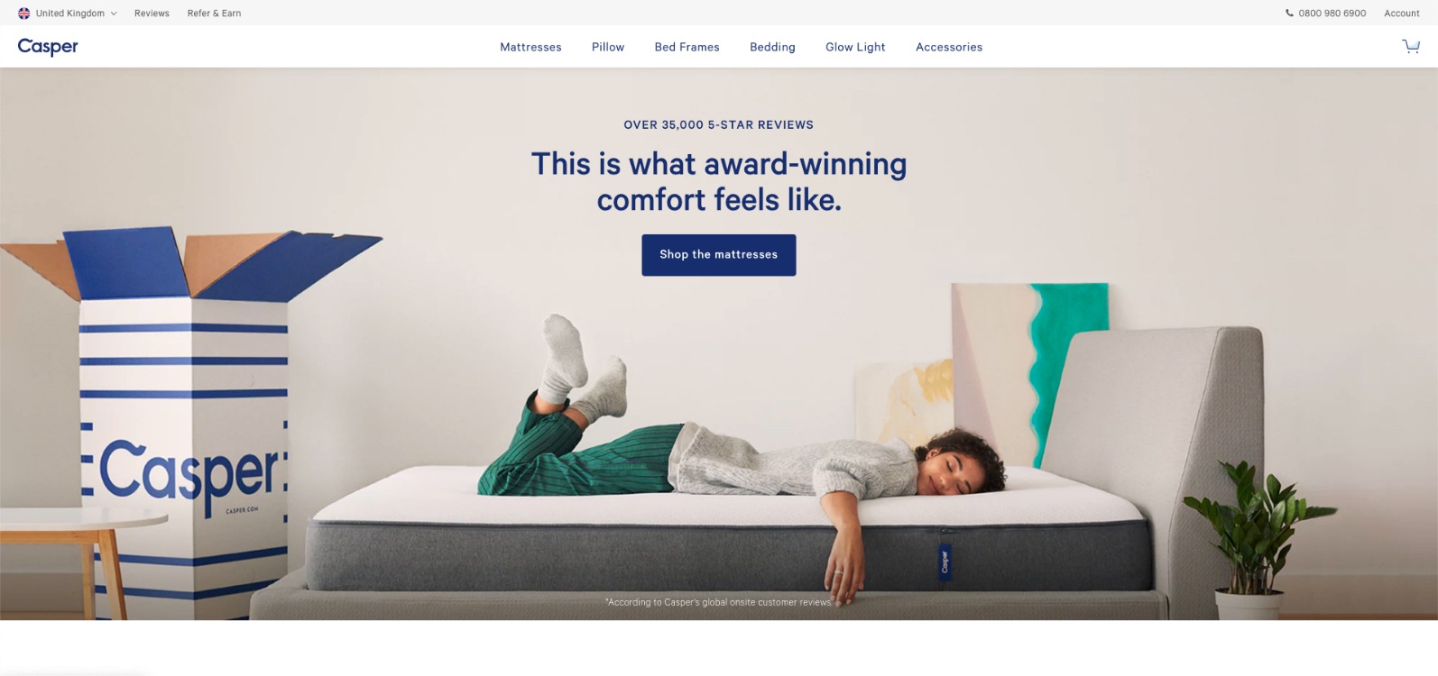
Notice that the CTA invites users to “shop the mattresses”. This awkward phrase causes the reader to stumble, lingering on the button. The way the brand is incorporated into the product image (in three places), is remarkably effective. The brand name appears five times in this screenshot…
2. Positioning Your Landing Page Strategically
Attracting attention from the wrong kind of customers is pointless. That’s why placement is important. This is not just about which part of the results page you occupy, or how you position your CTA; it is also about where your customers are in their purchase journey.
Someone who enters a broad search term probably isn’t ready to click “buy”. At the same time, someone who enters a precise search term probably doesn’t need to learn about your brand. Pitching your landing page at the right stage of the conversion funnel is essential. If your offer does not align with your audience, your traffic will quickly disappear.
How Ranking Coach Does Landing Page Optimization
This ad for Ranking Coach, a search engine optimization service, is associated with a very general search term (“traffic to my website”).

It is clearly designed for people at an early stage in the sales funnel and the landing page has been designed with this in mind. The CTA provides a very low hurdle (who can’t afford to “Learn More”?) and the endorsements are clearly displayed.
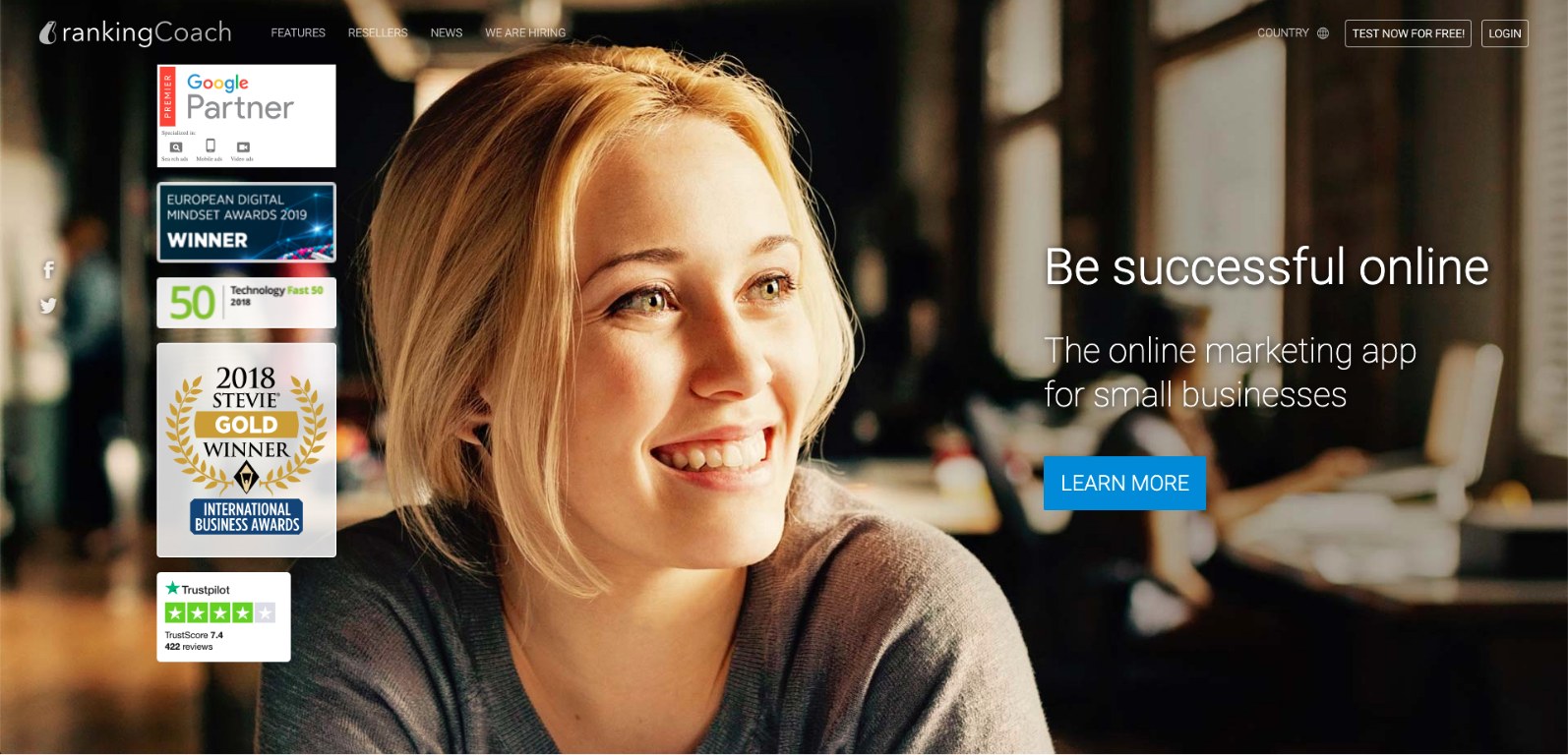
This landing page also uses an ingenious technique to capture and direct a reader’s attention. Whilst the female subject might not seem relevant, her eye-line directs the reader towards the landing page’s strap-line. This method is called “gaze cueing“, and it helps to give a landing page an unconscious visual structure.
3. Designing Your Page For Cognitive Ease
One of the most important components of landing page optimization is cognitive ease. Reducing the effort required to read and understand your content increases the number of people who respond to it.
- The first step is to anticipate your visitors’ needs, answering their questions and addressing their doubts. Understanding exactly what your traffic wants from your landing page is key.
- Next, consider the copy. You need to balance giving enough detail with keeping your page light; too much information risks drowning the reader.
- Finally, you need to design your page so that your readers don’t have to think too much.
How Uber Eats Does Landing Page Optimization
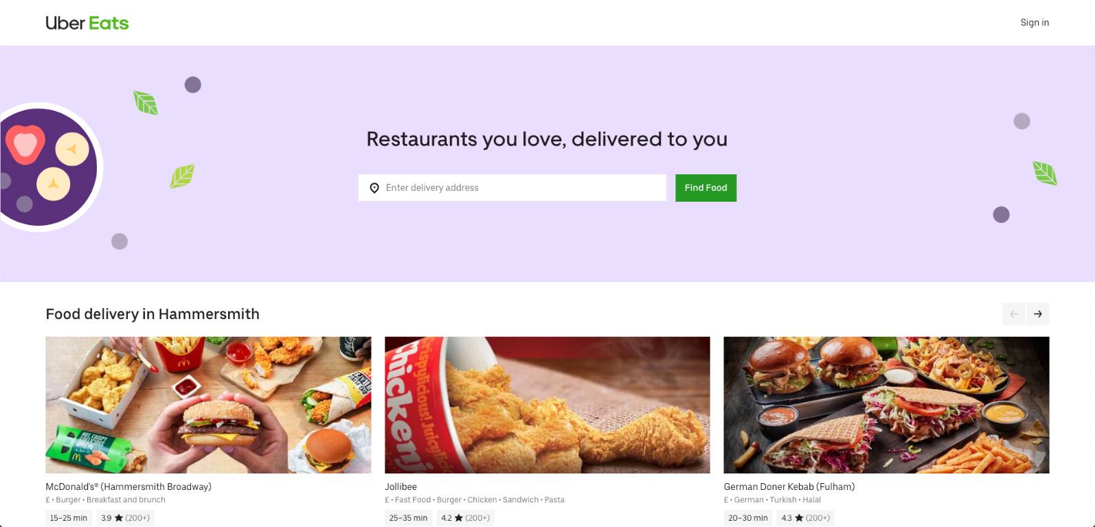
The best examples of easy-access landing pages are the ones designed by food-delivery websites. They know you’re hungry, and they can use your IP to find out where you are. Then, they show you local recommendations that remove a lot of the work from the ordering process. By asking for a delivery address as the first step, this landing page fast-tracks your order. The same information will be used to display the most appropriate options and will allow the app to pre-fill a section of your payment form.
4. Making Your Lead Capture Forms Magnetic
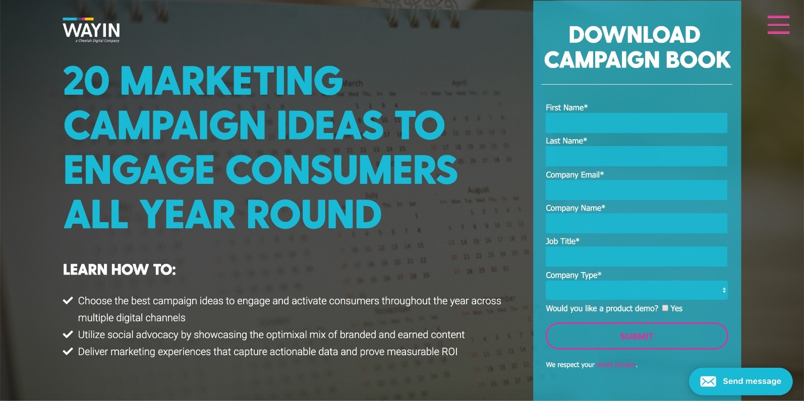
Browsers rarely give up personal information unless they are getting something in return. The incentive can be information, a special offer, or a free gift, but it has to compensate the visitor for their time, effort and discomfort.
These are some common lead magnets used to collect email addresses and other details from a landing page.
- Raffle tickets (enter your details for a chance to win a prize)
- Free downloads (enter your address to receive the report in an email)
- Invitations (fill in a form to be invited to an event)
- Games (enter your email address to create a player profile)
5. Keeping Your Traffic Engaged
Making an impression is important, but landing pages should aim to have a long-term impact. One way to do this is with a foot-in-the-door strategy.
Because most people prefer to continue an action, rather than changing what they are doing, a small commitment makes it easier to get a larger one. Asking a user to follow you on social media, or to subscribe to your newsletter, makes it more likely that they will make a more substantial commitment later. That’s why creating engagement is an important part of landing page optimization.
For example, the popular fashion brand J.Crew found that people who engaged with them on social media spent twice as much as the average consumer.
How Avanti Does Landing Page Optimization
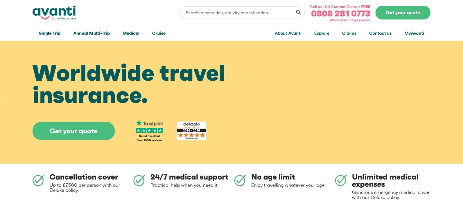
Insurance and comparison websites have some of the highest multi-session conversion rates. One reason for this is that they have a ready-made way to keep people in the sales-funnel. By prompting a user to request a quote, these websites turn one click into several visits (the initial visit, the quote retrieval and the conversion). That makes it far more likely that a user will stick.
6. Turning Your Landing Page Into An Event
You may have heard of “hive mind” or “hive mentality.” In the same way that groups of insects move together, other people have a big impact on our behaviour.
In uncertain circumstances, most people prefer to follow group consensus rather than challenging it. This phenomenon is undoubtedly enhanced by the assumption that others are more knowledgeable than we are. The influence of collective opinion is called Social Proof and, when understood, it is an essential tool for marketers. Because of the influence that conformity has on our opinions, the efficient use of social proof is a key part of landing page optimization.
Reviews and testimonials are a great way to secure your visitors’ attention and trust. Any testimonial should feature the name, face or logo of the reviewer, so that your visitors know it is coming from a real source.
Whilst it is tempting to fill your whole website with reviews, there are other ways to demonstrate how popular your products are. An easy way to use Social Proof without flooding your site with testimonials is to use website apps and plugins.
- Nudgify displays Google, Trustpilot and Capterra reviews that automatically sync with your business profile.
- Review apps, like Yotpo, collect reviews from users automatically.
- Social Proof Apps display Sales Pop messages that show when someone has made a purchase.
If it feels like the whole hive is interested in your product, visitors’ will be quick to want to join the party.
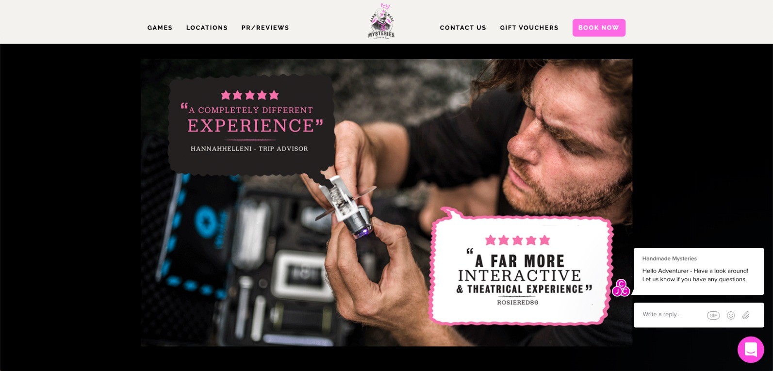
How Handmade Mysteries Use Social Proof To Optimize Landing Pages
Because some products are impossible to visualise, or have a social element, social proof is even more important. The theatre industry, for example, relies on reviews and ratings to generate audience interest. The way that landing pages are optimized within the entertainment industry reflects these concerns.
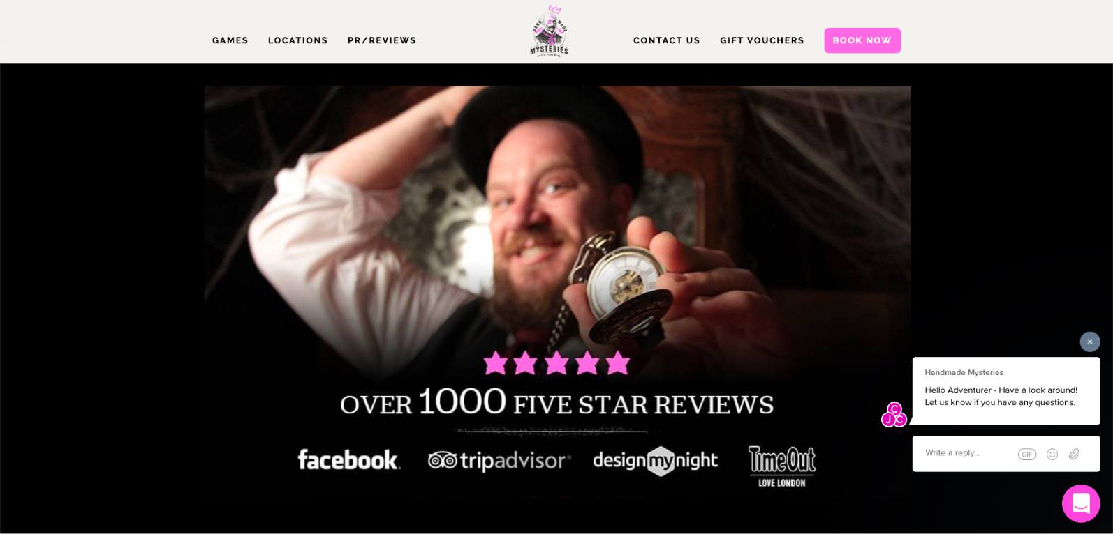
There are three kinds of social proof available to these kinds of products: customer reviews, press ratings and industry endorsements. The landing page for this experience-day company is designed as a sliding carousel, allowing for each form of social proof.
Conclusion
It’s hard to find clients in an ultra-competitive online market, and landing page optimization is a difficult skill to master. However, marketers have a secret weapon when it comes to winning clicks and business. Understanding the psychology behind consumer behaviour allows you to optimize your sales funnel.
Once a customer is drawn in, you can focus on keeping them engaged and entertained. If you manage to do that, those sought-after conversion rates are sure to follow.



Nice explanation and examples! Definitely the design of the landing page is very important for engaging customers on a website.
Absolutely! We’ve experimented with campaigns directing traffic to the homepage, product pages and even contact forms – for most cases the purpose-built landing page is easily the best.