Amazon Website Design: 5 Winning Conversion Tactics
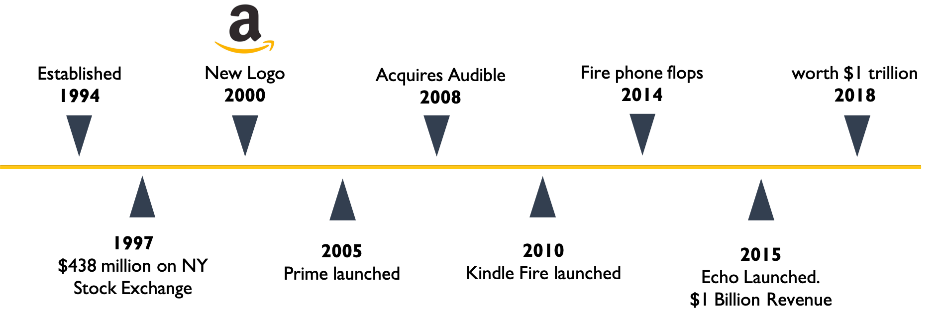
Amazon, a name chosen by the company’s creator Jeff Bezos to evoke the world’s largest river, is now more readily associated with its largest e-commerce website. In 2015, it reached $100 billion in annual revenues, the fastest a company has ever reached that milestone. With a long list of similarly impressive performance statistics, Amazon’s website design has helped Bezos to become world’s richest man.
Back in 1994 in the early days of the company, every time someone made a purchase from the bookstore located in Jeff Bezos’ garage, a bell in the office would ring. Everyone would gather to see if they knew the customer. It is probably good that this isn’t the practice anymore considering that this holiday season Amazon has sold more than a billion items. In 2016, it sold enough 4K televisions at Christmas to reach the peak of mount Everest more than nine times.

Initially focusing on selling books, Amazon has now diversified its business and sells everything from nuts to socks. Furthermore, a tenth of their income now comes from cloud-computing platform Amazon Web Services (AWS) which has grown exponentially.
This explains why there is a lot of interest in Amazon’s unprecedented success, but a closer look at the company and its execution reveals that, in the words of Seth Godin, “it takes about six years to become an overnight success”.
So what exactly distinguishes Amazon from the rest and what are the strategies that got them there? Amazon not only follows current trends but also uses sophisticated persuasive techniques and smart optimisation to provide a personalised and effective consumer experience.
There are 5 key conversion tactics that drive Amazon’s E-commerce success and help distinguish Amazon from its competitors. All of which you could easily introduce to your own websites.
1. How Amazon Website Design Creates Cognitive Ease.
Cognitive ease is a psychological principle which holds that we are much more likely to perform an action if we find it easy to do. Nobel prize-winning psychologist Daniel Kahnemann explains in his book Thinking, Fast and Slow (2011) that our brains have two modes of thinking; the first operates automatically and quickly and the second requires attention and effort. Because we are what Fiske calls “cognitive misers” we prefer not to invest too much of our cognitive efforts to making a decision. Therefore, we are much more likely to perform an action, whatever its nature, if it is relatively easy to do so.
Guided by this principle, Jeff Bezos explains how his company is based upon two types of decisions Type 1 and Type 2. Type 1 decisions are irreversible and should be made with caution. Type 2 decisions are like “two-way doors” and should be made quickly. Bezos has not only tried to apply Type 2 decisions to his risk-taking strategy but also to the website itself.
How Type 2 Decisions Are Built In To Amazon Website Design
There are 3 simple areas that show how Amazon harnesses Type 2 decisions within their ecommerce strategy.
- Click and collect
By showing how the pick-up point looks like Amazon presents the “end point” in mind which makes it seem like an easier process.

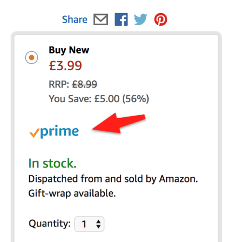
- Prime/ next day delivery
The prime accredited with a tick suggests immediate delivery (and safeguards on returns) which relies on the principles of (principle a) and (principle b).
- One-click Ordering
By storing customer details including payment information, customers can purchase with a single click. This shortened and simplified process reduces the pain of paying, as they almost feel like no money has changed hands.
2. Use of Personalisation in the Amazon Website Design
Amazon delivers high levels of personalisation, making the whole experience feel as if you are going shopping with a friend who’s known you for years and is there to guide you.
Key Personalisation Techniques Used By Amazon
Firstly, Amazon creates very specific recommendations produced using item-to-item collaborative filtering. This system works in real time using massive data sets to generate high quality recommendations.
What does this mean? Unlike other stores, who match users to similar customers, Amazon’s item-to-item collaborative filtering matches individual user purchases to rate items against other similar purchases to create a personalised list of recommendations.
This is another example relating to cognitive ease bias. When customers click on “your recommendations” they are lead to an area where they can filter suggestions by product and subject, ensuring that they are not overwhelmed by choices.
They also see precisely why products are recommended to them which adds a nice personal touch, just like that caring friend that knows everything about you. To determine the most similar match, the algorithm identifies products that are most commonly bought together.
Amazon’s email marketing constantly checks in with you and see how you are doing. Their emails deliver important information about your purchase, whilst promoting other products that might be of interest to you. And if you forget to complete your purchase, they will also email you to remind you – so that birthday present will make it there on time!
This is an example of an email sent with your delivery information, it lists other products that you might also like.

Bezos believes that companies should not focus on their competitors but on their customers instead, which is exemplified by their excellent customer service. According to the Temkin Experience Rating respondents, Amazon ranks well above other retailers. It ranks first with PetSmart for retail expertise and fourth overall out of 293 companies in 20 different industries.
3. Persuasion Tactics and the Amazon Website Design
Amazon also employs quite a few persuasion tactics based on tried-and-tested cognitive principles. Whilst they deliver them in the form of in-text labels, many other retailers have success with pop-up persuasive notifications.
One of the psychological principles that the Amazon website design uses is that of social proof. Social proof is the phenomenon whereby people look to the behaviour of others for how that should act in any given situation. This is largely driven by the desire to “fit in”, not wanting to stand or be seen as abnormal. When we act in accordance with other’s behaviour, we feel as though our actions are “validated”.
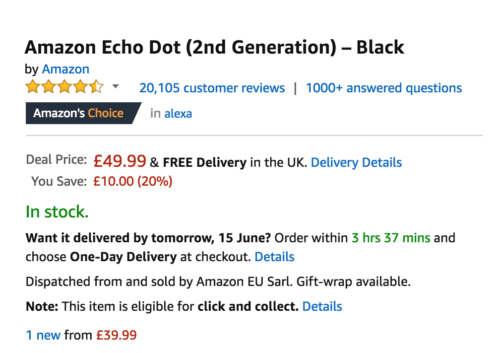
Amazon harnesses this principle by using the five stars to visually display other customers’ ratings as well as detailing the number of customer reviews.

4. How the Amazon Website Design Exploits Scarcity
The principle of scarcity follows the simple premise, that if a large volume of an item available, this implies a lack of popularity, whereas if only a small quantity remains, there is huge interest. This is a familiar phenomenon for retailers and they use the tactic to urge customers to take quicker action and finalise their purchase. For example, by displaying stock quantity.

5. Anchoring Points of Reference on Amazon
Another useful principle is that Anchoring. It is the principle whereby people use the first point of information they receive as a point of reference. The human mind does not consider something in isolation but rather uses its comparative value to make a decision. This is why often the initial higher price is displayed and crossed over and a lower one offered next to it.

Conclusion
When we dismantle Amazon’s website design, we find five main conversion tactics: cogntivie ease, personalisation, persuasive notifications, scarcity and anchoring. They are not difficult to implement and could be the key to your website’s successes and conversion boost.
Are there other simple conversion tactics used by Amazon? If you know of any, please let us know in the comments.


Yes! Finally something about optimisation at Amazon