Upgrade Your Online Customer Experience With Real-World Techniques
Despite claims that eCommerce has finally conquered the high-street, brick wall stores appear to be here to stay. Traditional shops do some things better than their digital counterparts and understanding why can help you to improve your eCommerce website. This article outlines 5 quick ways to upgrade your online customer experience, based on the psychology of the shop floor.

5 Quick Ways To Upgrade Your Online Customer Experience
The advantages of real-world stores become more obvious when you start to think about consumer behaviour. Psychology is often neglected by online stores. The strategies outlined below recreate traditional retail experiences for your online customers. Firstly, though, there are some things you ought to know about how they are using your store.
How Customers Really Use Your Website
People have been discussing the advantages of digital and brick wall stores since eCommerce first entered the mainstream. There are a few plus-points for each.
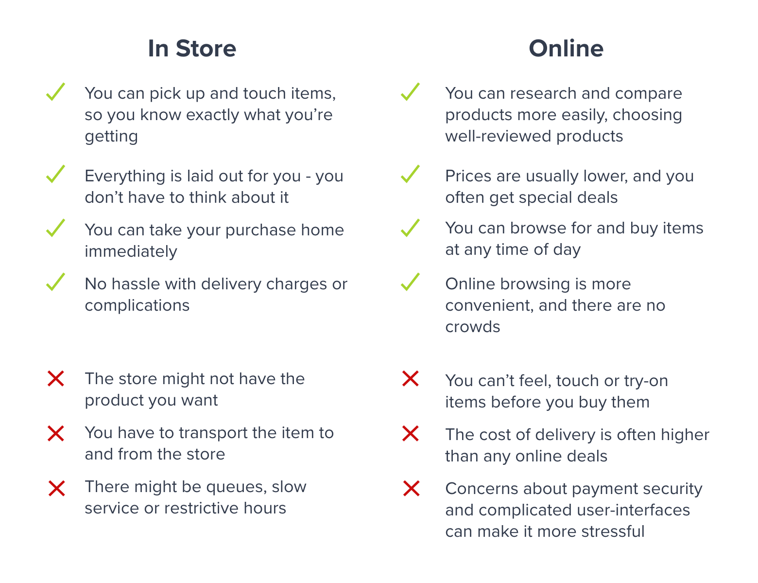 These themes are borne out consumer research. Recent surveys have given some clear insights into consumer habits.
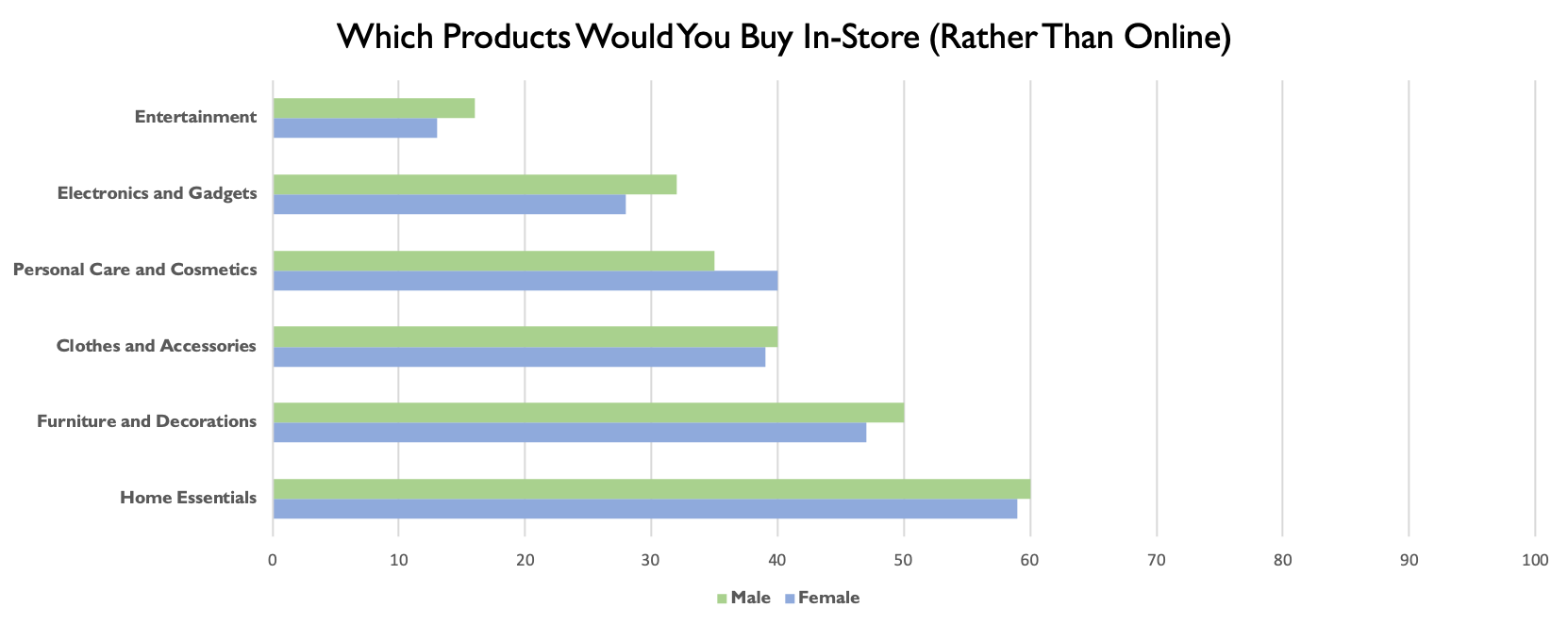
- Some Things Are Better Online. The consumer research body Retail Dive conducted a survey on over 1000 consumers – asking which products they preferred to buy in person. Out of six categories, participants preferred buying only one in a traditional shop.
- Cyber Spending is Easier. In September 2018, Whistl conducted a survey showing that the majority of shoppers spend more online than they would in-store (around £50 more per session).
- Boundaries are Blurring. A survey conducted by RetailDive (with over 1400 participants), highlights a combined “brick-and-click” approach to shopping. Participants mentioned two things that eCommerce was unable to replace: 1. Trying and testing items 2. Taking them home immediately
The continuing relevance of traditional stores highlights aspects of customer experience that the internet has not managed to replicate. Many of these are due to psychological and behavioural effects. Brick wall stores do not require any problem-solving attention, which makes them feel more convenient – even if real-world shopping takes more time and effort.
5 Quick Ways To Upgrade Your Online Customer Experience
Traditional shop floors demonstrate a number of features that can help you to immediately upgrade your online customers’ experiences. Any good eCommerce store should provide the same sights and sounds as a well-organised shop floor.
Making eCommerce as intuitive as a well-organised store is difficult; customers are not able to see things at a glance or pick items off the shelves. However, these five techniques will immediately upgrade your customer experience and increase your conversion rates.
1) Create Immersive Experiences
The most consistent reason for preferring traditional shops is the ability to pick up and explore the products. This also increases conversion rates; just holding an item exposes consumers to a powerful Endowment Effect. Providing access to your products will make your visitors more inclined to buy.
HD images are the first step to sensory immersion, and 360-degree images are used by a number of luxury brands. However, 3D imaging is likely to become essential in the next ten years.
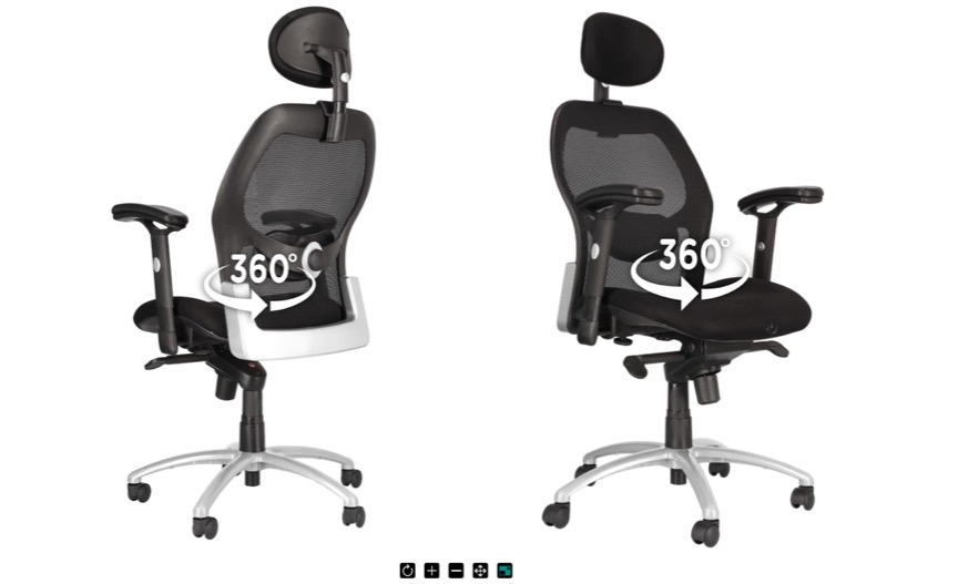
Other websites achieve the same “see”, “feel” and “touch” experience through video, screen-filling graphics and audio content. However, the best way to let customers experience your products is probably the low-tech solution: hire an amazing copywriter. If you can create incredible product descriptions your customers’ retail experience will improve immediately.
2) Use Social Levers
Brick wall stores have one major advantage: customers can see each other. The best advert for a shop is a crowd, and a clean window can stop passers-by in their tracks. Incorporating social effects is the most effective way to improve your online customer experience. Unfortunately, it is hard to get right.
The Science of Social Commerce:
Since the 1930s, psychologists have been intrigued by the influence that groups have over individuals. Early psychologists like Muzafer Sherif observed the impact of group persuasion on the perception of seemingly objective things. In 1984, Robert Cialdini coined a term for these effects: Social Proof.
The most successful platforms use testimonials and social sharing to apply a range of effects, including Social Proof, FOMO, Scarcity and Social Cognition.

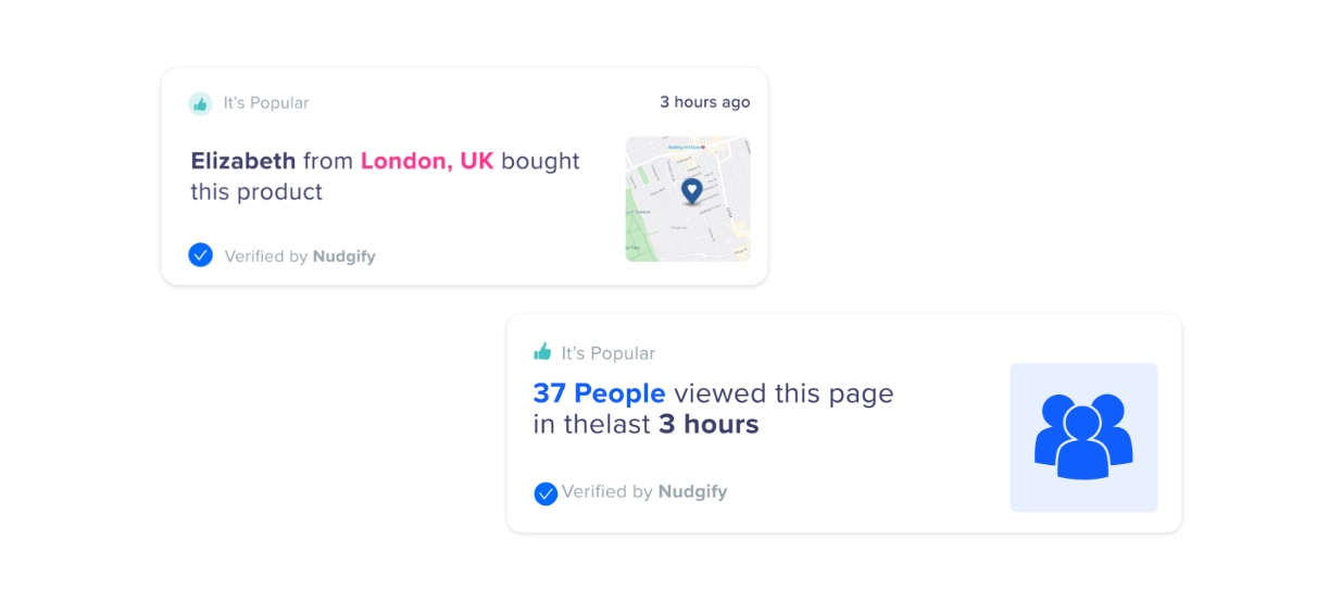
However, these static features struggle to match the immediate visual impact that shop-floor dynamics provide. An alternative strategy is to use live notifications and nudges that replicate the “buzz” of a busy shop. A Social Proof App, for example, integrates with a store’s live data to display stock levels and information about previous customers.
3) Create Gamified Experiences
Some people go to the shops just to browse. They are not interested in a specific item; they just want the thrill of finding a bargain. Motivating Uncertainty describes the way in which uncertain outcomes are more appealing than fixed rewards. Whilst this phenomenon is difficult to replicate online, some digital stores have found ways to incorporate the excitement of chance and gameplay through gamification.

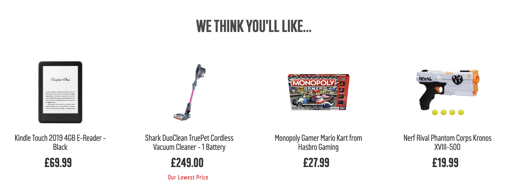
Additionally, eCommerce giants have become experts at curating recommended lists. These features allow users to experience the thrill of the unexpected. Impulse purchases can improve your online customer experience and increase you average order value.
4) Engineer Your Space
The layout of a shop influences how people behave. The same is true online. That means the architectural techniques used to create efficient retail spaces are also relevant to the digital boutique.
“Decompression Zones”
In his Why We Buy, consumer analyst Paco Underhill highlights a particularly awkward feature of consumer behaviour: entry speed. When someone enters a shop, they go through a period of adjustment (eyes dilate, olfactory senses heighten, memories are cued). Most brick wall shops have deliberate zones to slow people down and help them acclimatise. However, the “decompression zone” is missing from online retail.
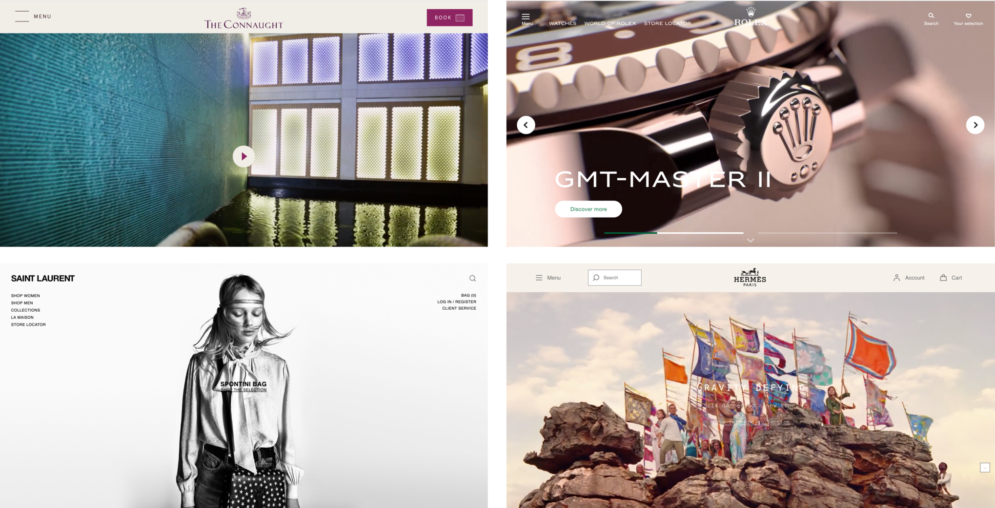
Whilst most online stores prioritise speed and efficiency, ethical brands and luxury stores offer a longer landing-strip. This is not wasted space; the decompression zone is an opportunity to give your products context and ensure your customers are in the right frame-of-mind. Retailers like Tiffany & Co, The Connaught and Rolex devote all the space above-the-fold to this purpose.
Social Spaces
Most people who walk into a shop on their own buy one thing, and most people who walk in with a partner buy more. This principle has led retailers to embrace the social aspect of shopping. Chairs are provided near changing-rooms, the spaces around mirrors are usually big enough for two people, and the music is never too loud for a conversation.
Recreating these social spaces online is difficult. No-one has cracked the challenge of simultaneous browsing (have you ever tried to book a hotel or flight with a partner?) If an eCommerce store made it possible for groups to collaborate on a purchase in real-time (splitting the bill, even) they would benefit from one of the oldest tricks in the book.
There are also more conventional ways of making the online customer experience more social, such as:
- Participatory design
- Community memberships
- Message boards and pin boards
- Social media integration
5) Differentiate Your Displays
Brick wall shops are built for bodies. Specifically, they are built for customers’ bodies. That’s why children’s toys are placed on low shelves and educational games are eye-level for parents. It’s also why visual displays aimed at older customers are easier to read.
Despite this being one of the most obvious ways to improve customer experience, the way that products are displayed online is usually based on what’s easiest for designers or developers. Even the largest platforms stick to a consistent display (whether the product is a water-pistol or a walking stick.)

Why Customer Experience Matters
In a literature review published in 2019, eMarketer collected data on what made US consumers return to an online store. The survey found that 49% of internet shoppers valued a good product selection and 40% were concerned about customer service. Online customer experience is not just about window-dressing, it is about improving conversion rates and enhancing customer lifetime value. Combining a great user experience with a strong eCommerce conversion rate is the best way to ensure your store’s long-term success.


Thanks for sharing – never got knowledge like this! Thank You.