Von Restorff Effect
What is the Von Restorff Effect?
The Von Restorff Effect describes our tendency to remember things that stand out or, in other words, that we are more likely to remember the unusual. This principle can be applied to all manner of things: words, products, images, communication messages, an unexpected happening during a course of standard events, etc. This effect manifests itself due to the contrast evoked between one element and the others which causes our brains to wake up and pay more attention, meaning that this different element will not only be noticed in the present moment but stick in our brains for longer.
Examples
This principle is often used in the world of marketing and advertising to engage a target audience, and is particularly effective in this age of multiple communication platforms. An advert that stands out from the rest (be that through its tone, visuals used, unique message, or other mode of distinction) will be more effective.

The Von Restorff Effect in Marketing
There are some simple ways that the Von Restorff Effect is used to great effect by some of the biggest E-commerce brands on the planet from AirBNB, ASOS, Skype, Skyscanner, GoPro and Google to Emirates.
- Use contrasting colours and size for your CTA Choosing a contrasting button colour and size will make it more prominent on your page so that your visitors are more likely to click on it.
- Blur of fade images to reduce focus on them Your visitors will immediately be attracted to the notably different items on your page, in this case it will be the non-faded elements.
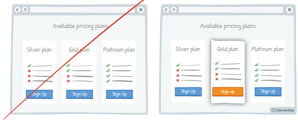
- Put your default pricing plan in the centre and more prominent Placing it in the middle and bringing it to the front, using highlighting or putting the Call to Action button in a different colour, will help it to really stand out from the other options so that people will automatically be drawn to it.
- As a user moves within your website, alter the CTAs Depending upon the page on which your Call-to-Action features, you could try altering the colour at time intervals or as visitors scroll down the page to see an increased focus on the button and higher conversion.
- Display links already used in a different colour Using another colour will help those links to stand out, which will help the user to keep track of what they have previously done on your site and avoid wasted time or undesired repetition.
- Make your CTA dynamic and delay it After the customer has taken in the page content and is at the critical moment of deciding whether to buy, displaying your Call-to-Action in this way will draw their attention and encourage click-through and conversion.
Von Restorff Effect
Contrast is both a simple and powerful way to encourage your browsers to become buyers. With a few small changes to your digital marketing, you can significantly improve the speed, value and frequency of conversions.
