7 Innovative Ways To Improve Your SaaS Conversion Rate
If you’re scratching your head to figure out why every other shop seems to be selling more products than you do, we can help you improve your SaaS landing page conversion rates.
Let’s assume you want sales uplift. You’re using a mixture of techniques like paid advertising, email drip campaigns and a referral program.
Here’s our suggestion: Throw out the rule book and check out these seven unusual but incredibly effective ways to improve your conversion rate — and no, they’re not the common CRO principles that everybody knows.
Here’s a list of techniques you’ve probably never heard of.
1. Unconventional “amateur” landing pages
Amateur landing pages aren’t particularly attractive from a design point of view, considering the trend toward simplicity and minimalism, but they are highly targeted to convert.
Landing page design has its own rules about what works, and we all know an overcrowded page can be a huge turnoff for potential customers. But customers don’t really want “beautiful.” They want relevant and a sense that this “solves my problem.”
Gumroad is pulling off an amateur-style landing page really well.
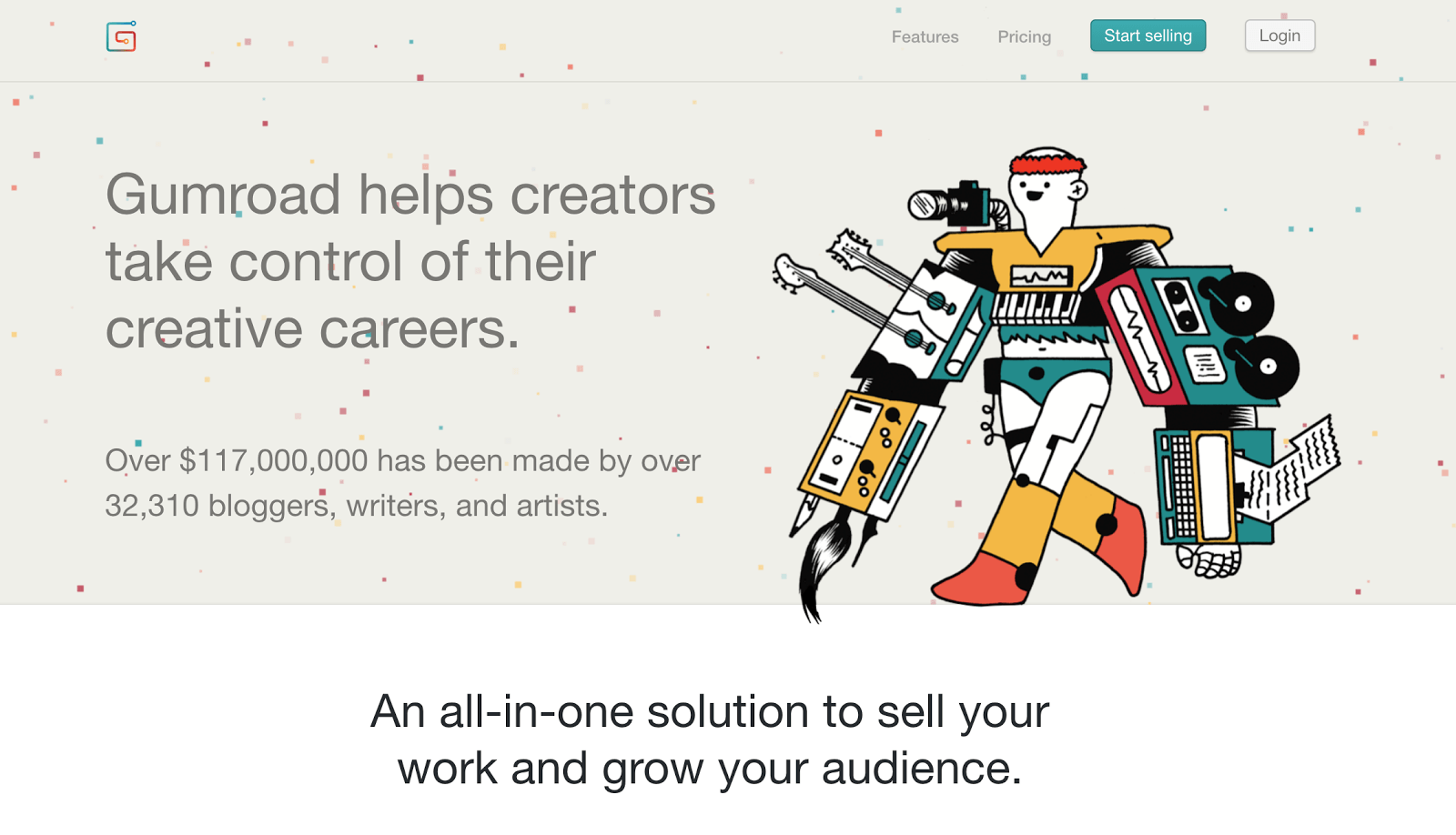
Screen capture of Gumroad’s unique, eye-catching homepage (image source)
The screen features continuously falling confetti. The background color is a dull grey, the font is plain, and the image is a childlike giant cyborg sporting a red hairband. It has the potential to overwhelm visitors, but it works because it’s so specific.
Deliberately using an amateur-style design suggests that you know the rules for landing pages but are confident enough to think outside the box. Consider hiring a professional landing page designer for this through an agency, or in a freelance marketplace like Upwork.
Buck the trend of overly optimized landing pages in favor of an amateur style that turns heads.
2. Distinctive copywriting techniques
Don’t underestimate the power of persuasive copywriting. It’s far more than just words, because it’s aimed at compelling the reader to take immediate action. To give your copy more impact, you need to think carefully about your choice of words.
Use the specific language your target audience uses, and we don’t just mean industry terminology. If your audience is millennials, you should communicate in a way that appeals to them (and no, not using emojis and LOLs).
This means employing powerful words instead of the tired old language everyone hears all the time. For example, “skyrocket your sales” instead of “increase your sales,” “crush the competition” rather than “beat the competition,” or “jumpstart your marketing strategy” rather than “start your marketing strategy.” You get the idea.
Put plenty of effort and energy into your copywriting. Good copywriting means bucking the trend in your industry and the tired ways brands usually express themselves.
Groove is a great example of the type of copywriting that will make a SaaS landing page convert. The company’s word choices are bold and unique, and it has developed a memorable brand voice.
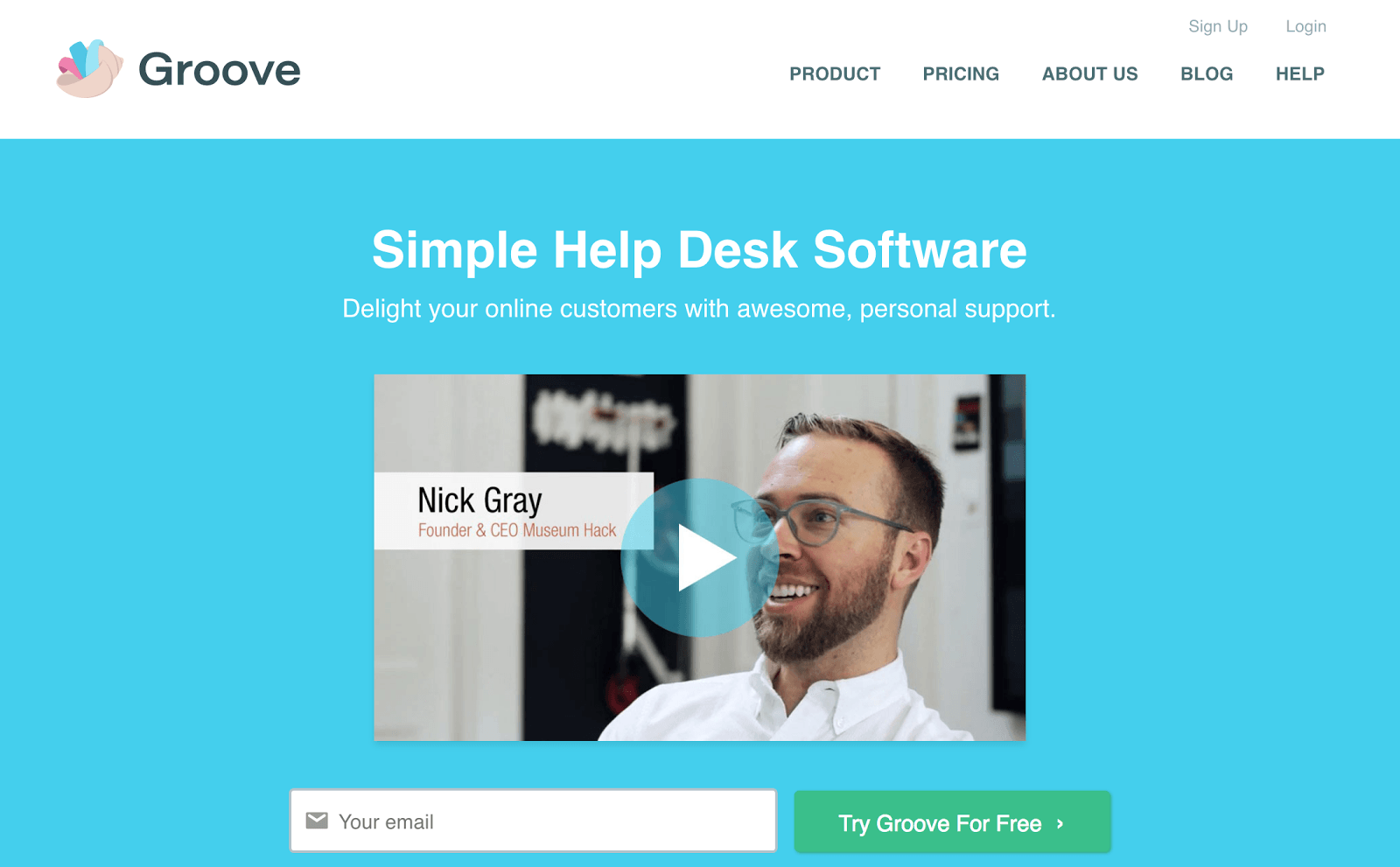
Screen capture of Groove’s homepage featuring their distinctive copywriting (Image source)
The verb “delight” is distinctive, while the adjective “awesome’ is a little different from words Groove’s audience might usually see.
Carefully review and edit your copy, then highlight any words or phrases that seem cliché or boring. Think of alternative ways to say what it is you want your audience to do. Consider testing various versions of your copy to see which one is most persuasive to your customers.
3. Present a reason to act, with the power of “why”
Creating urgency is more than just displaying a fake countdown timer that you’ll “reset” the next time you want to run a marketing campaign. You want to make your audience feel a sense of urgency, a belief that their problem is so important they must not waste any time before they buy your product to solve it.
The urgency is closely related to the why. It’s not about listing product specs and rattling off statistics. Tell your customers why they need your product to solve their problem, right now.
This is an example of Canva using emotional urgency in their email marketing. They’ve asked subscribers to sign up for “early access” to Canva for Work. This will only be for a limited time.
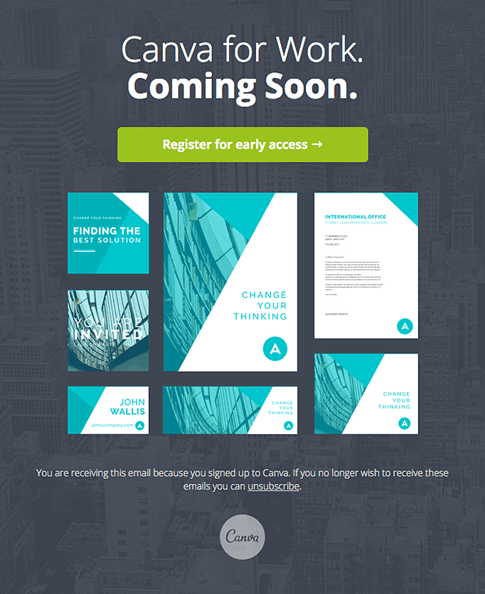
An example of Canva’s stylish and engaging email marketing asking subscribers to sign up for Canva for Work (Image source)
The images they’ve chosen make this email feel inspirational and compelling — you want to be the company with professional marketing materials that look like this.
The next time you create an email campaign, list all the most compelling reasons why your customers will benefit from using your product. Choose the best one, and combine it with an offer such as an opportunity for early access. Communicate your message with engaging visuals.
4. Use personalized referral landing pages
Word-of-mouth referrals are 26% more effective than the second most effective marketing channel (search engines). According to Nielsen, they are the most trusted form of advertising, by a long shot.
It’s a good idea to automate your referral process with software that personalizes your SaaS landing pages, the way Freshbooks did. A recommendation from a friend is 50 times more likely to trigger a conversion than one from a stranger.
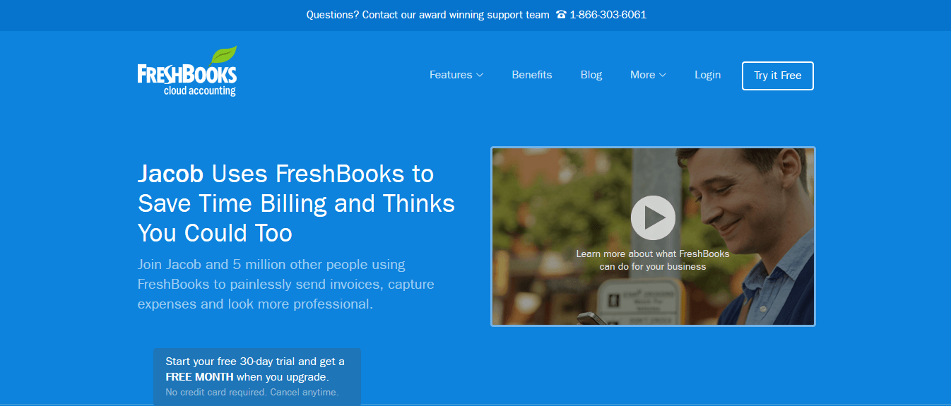
Screen capture of Freshbooks’s personalized landing page for their referral marketing campaign (Image source)
You can use a tool like Referral Saasquatch, Ambassador or Yozio to provide social proof with your customer’s name for referral campaigns.
5. Develop segmented email drip campaigns
The reality is that 40-60% of your users will sign up for your SaaS product, use it once and never come back. Or they will buy a subscription, but you might struggle with cash flow over the next several years. It cost so much to acquire a customer, but you receive only a small amount of revenue on a monthly basis.
Wouldn’t it be better to take your customers’ subscription payment for a whole year all at once, for more cash in the bank?
WP Engine sent letters to their customers to get them to upgrade to the yearly plan. This was phenomenally successful for them and improved their signups.
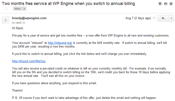
One of the emails WordPress sent to their subscribers to upsell them the yearly plan (Image source)
They sent a series of highly targeted, plain-text emails to their customers asking them to upgrade.
Buffer has done the same thing to promote their new software plan:
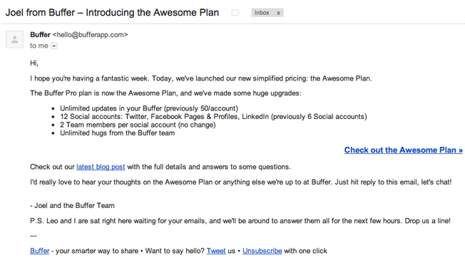
Buffer’s email to their customers about their new pricing plans (Image source)
The intent of your email drip campaign is to move your customers up the marketing funnel.
If you start segmenting your customers in your CRM now, your campaigns will be far more relevant and powerful later down the road. Ideally, this will be integrated with your email marketing software for easily segmented campaigns.
Because your drip campaigns are meant to turn qualified leads into paying customers, you need to learn more about your subscribers so as to market to them effectively through email.
To collect data, you can send an email to subscribers asking for more information. Or, when you get new users to sign up through the landing page, ask them to pick an option that tells you more about them (for example, whether they have used a product like yours before, or the size of their company).
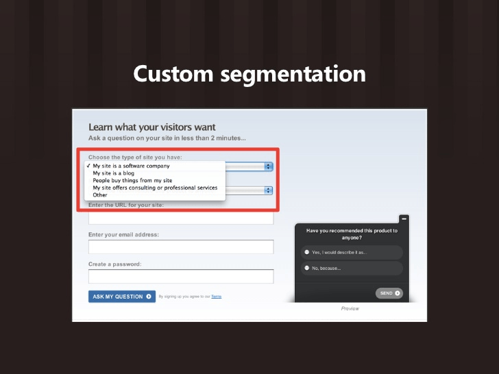
A page asking for more information about a visitor for the purpose of segmentation (Image source)
6. Use targeted landing pages for paid ads
Many companies make the mistake of investing lots of their budget in online advertising, only to send their customers to a generic landing page that doesn’t convert. Specific campaigns need to be linked to landing pages with the same messaging to increase your chance of turning your visitors into leads.
If you’re running a Facebook ad campaign that tells your customer they’re getting a limited-time free trial of your app, your landing page needs to specifically relate to this message — it definitely shouldn’t just be your homepage.
TransferWise makes effective use of Facebook advertising for its international money transfer service.
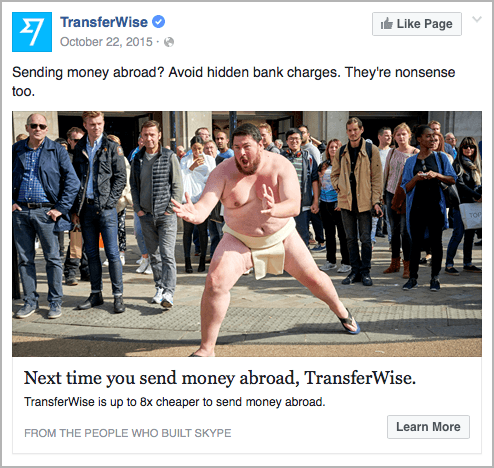
Example of TransferWise’s Facebook advertising
The company recently ran a series of ads for its borderless bank account. The ads were linked directly to a targeted landing page. Users knew exactly why they were there and what they were expected to do (sign up for the account).
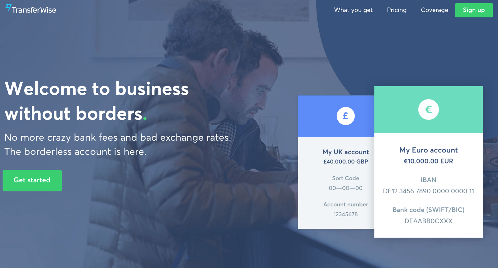
Screen capture of the TransferWise landing page for one of their PPC ad campaigns promoting their new business bank account (Image source)
Aim your PPC campaigns at customers who are ripe and ready to convert (for example, app users reaching their freemium limit), serve them well-designed, targeted landing pages, and watch your conversion rates soar.
7. Use design to point customers towards your CTA
Do your customers a favor by holding their hand and telling them exactly what you want them to do.
Don’t assume that your intentions will be obvious when a customer hits your landing page. A SaaS landing page should be set up in such a way that users have no choice but to eventually follow your CTA.
You can use directional cues, such as an image of a person whose gaze is directed at your CTA button. Aptrinsic could have improved the design of their homepage using this technique to make it more conversion-friendly.
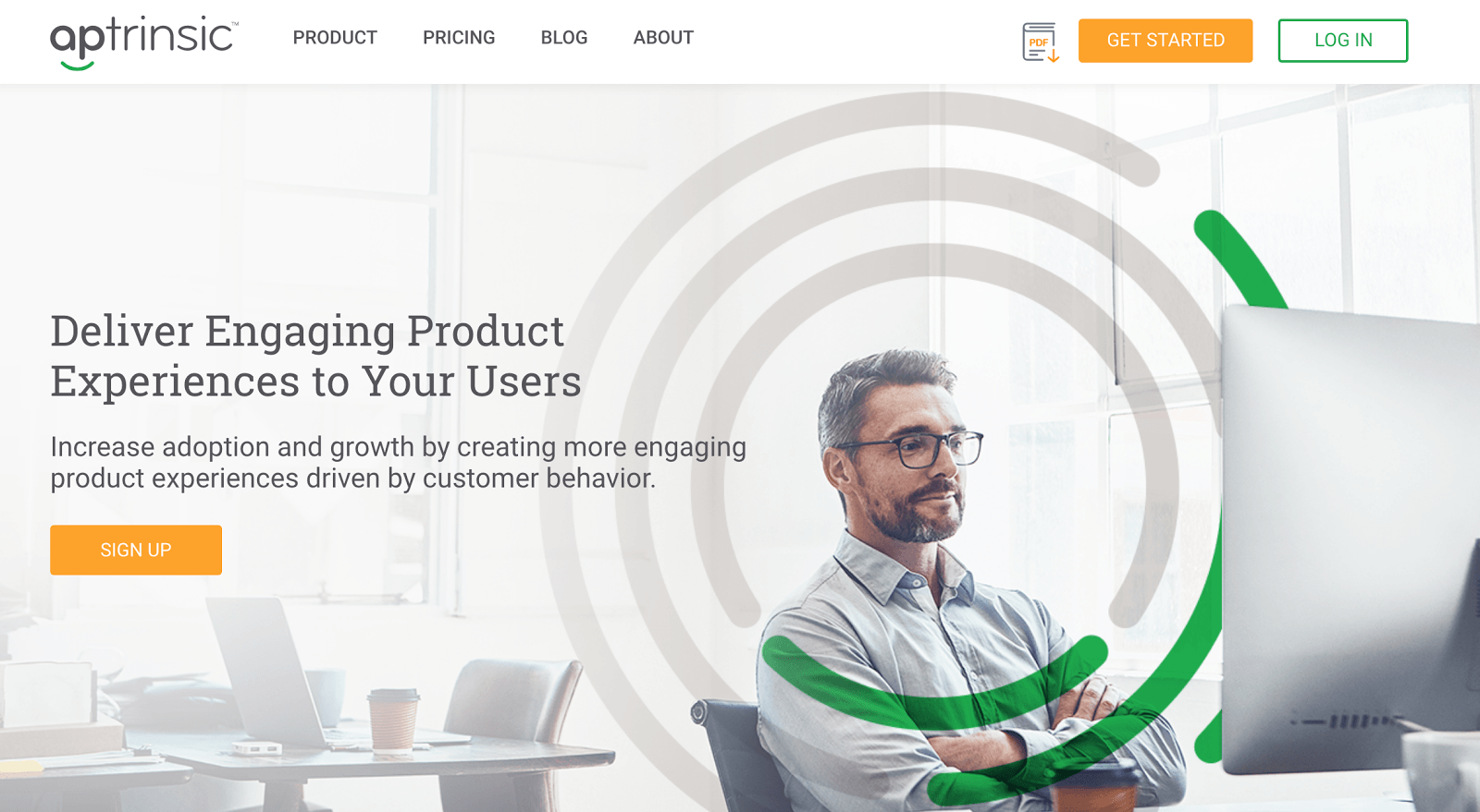
Screen capture of the Aptrinsic homepage, which could do with some CRO (Image source)
At the moment, the directional cues on this page are pulling the user in multiple directions, which doesn’t help in producing conversions.
The page emphasizes a man sitting with arms folded, within concentric circles, but neglects to point users toward the orange signup button.
Aptrinsic would do well to swap the image to the other side of the copy and CTA button, since users naturally look from left to right. The man’s gaze would then be looking toward the button, encouraging users to click.
Eye gaze and line emphasis are just two types of directional cues that create a path for the user to follow.
Here’s an example of Kissmetrics smashing it with their directional cues:

Kissmetric’s landing page with the image of a man looking towards the CTA button and input field (Image source)
Don’t be afraid to be obvious. Use directional cues like arrows or lines and gaze direction to point your visitors toward your CTA button.
Conclusion
If you’ve tried all the usual methods and your conversion rate still won’t budge, it’s time to give some of these unusual techniques a try.
You can focus on:
- Optimizing your campaigns with copywriting that bucks the trend
- Building unconventional “amateur-style” landing pages
- Personalizing your referral pages with customer names
- Investing in email drip campaigns to help you upsell to your subscribers.
- Upgrading your website with visual cues to guide your customers towards the primary call-to-action
Your customers can sense when you have put in the effort to win their business, and they’ll respond when you show them you have something relevant to offer them.
Identify which marketing channels have the highest ROI for your business. Direct more of your resources to your most effective channels, to generate more leads without spending more money.
What unusual tactic will you use next to stand out from the crowd and win the attention of your customers?

