How Zalando could optimise their product page to increase sales
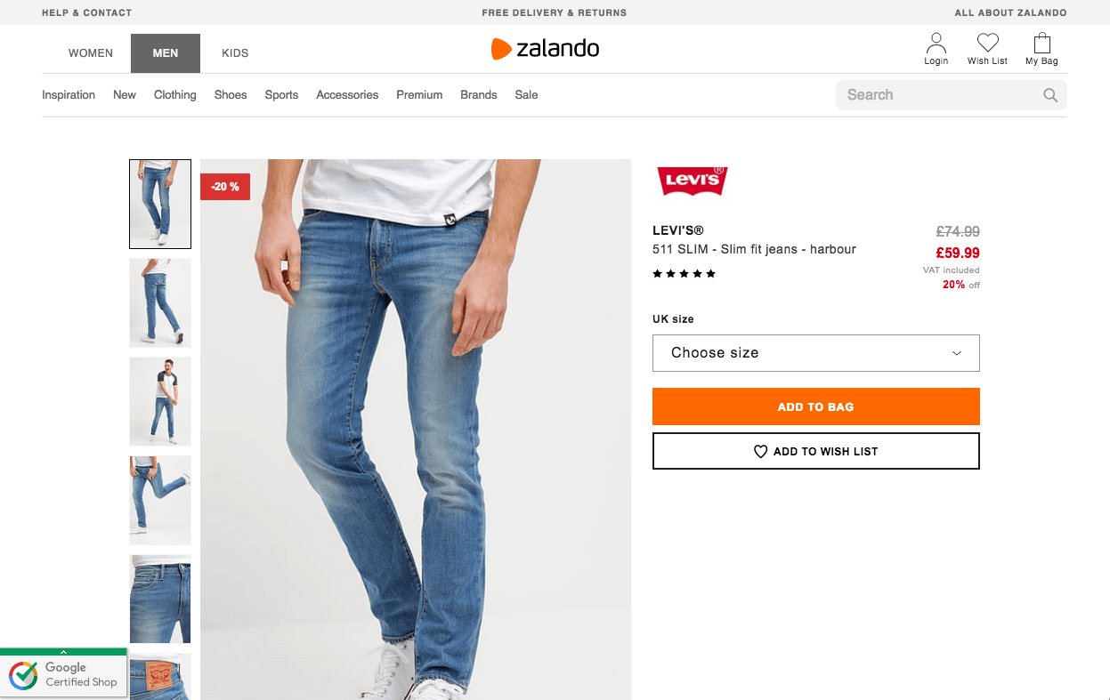


In this case study we show you how easy it is to implement product page improvements that are proven to increase sales, using Zalando as an example.
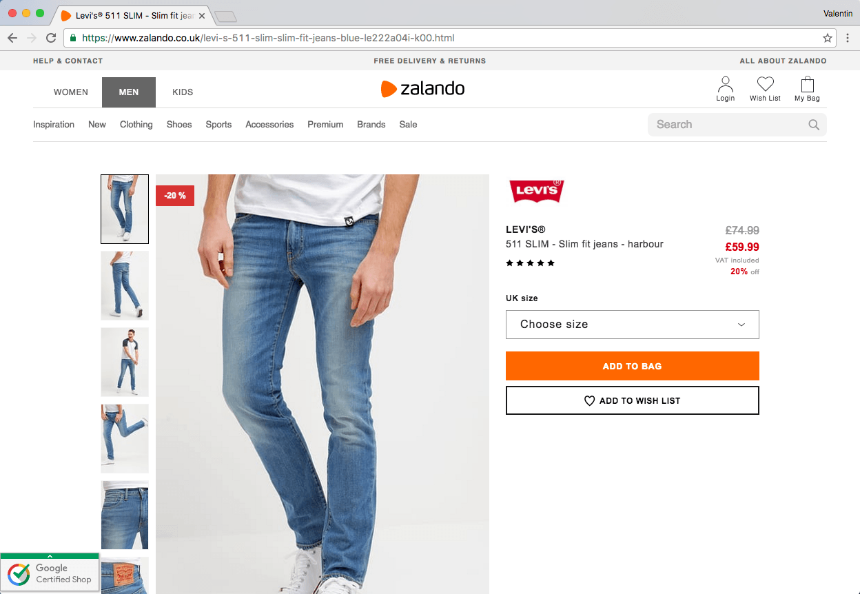
Original page:
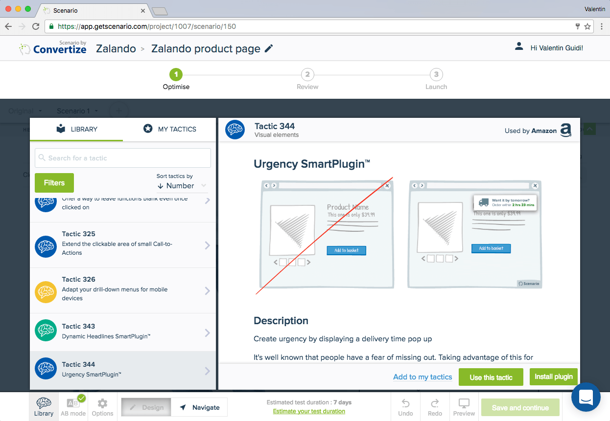
Tactic 344: Create a scenario using the SmartPlugin™
The use of the Urgency SmartPlugin™ will induce urgency in your customers by displaying how quickly they need to act in order to benefit from next-day delivery.
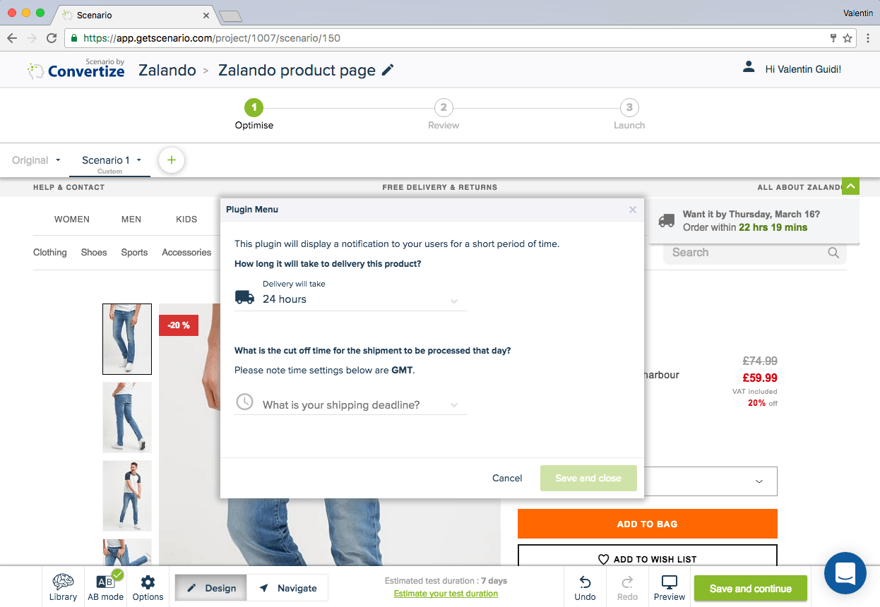
Editor (Tactic 344): It couldn’t be easier to implement. You simply need to install the plugin then fill in your delivery time and that day’s shipping deadline.
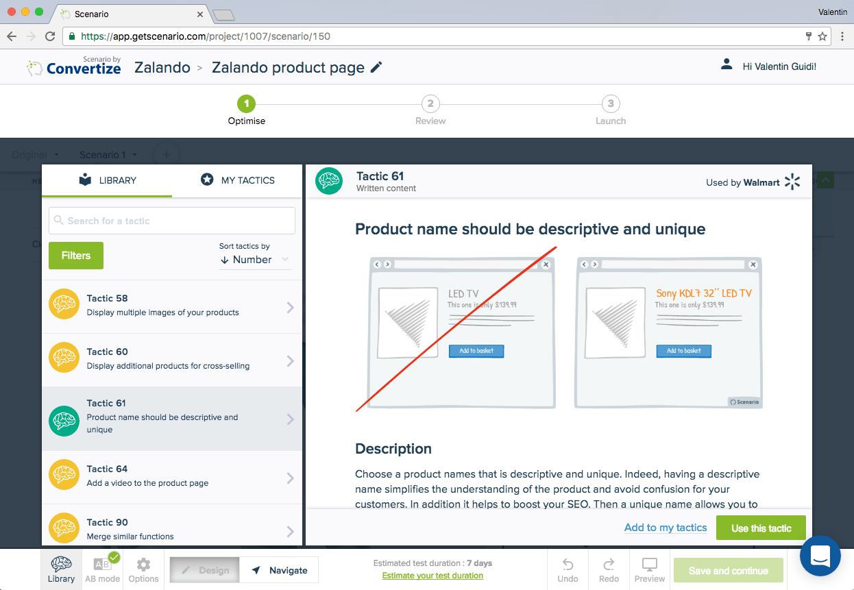
Tactic 61: Give your product descriptive and unique names. To avoid any confusion or misunderstanding between products, giving each product a unique name that includes details is crucial. This way, users won’t have to think or encounter frustration when searching for a particular product.
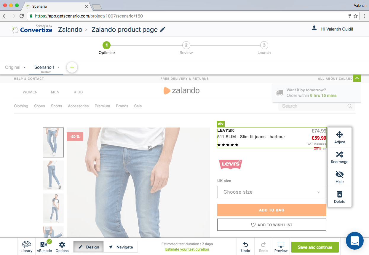
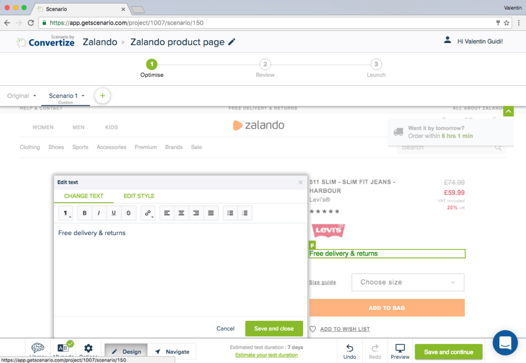
Editor (Tactic 61): In the Zalando example, we swapped over the positioning and prominence of the Levi’s logo and the product’s descriptive text “511 SLIM, Slim fit jeans – harbour”. We used the “rearrange” option as shown below.
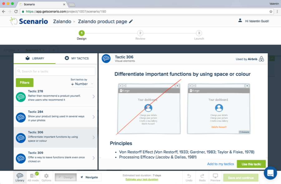
Tactic 306: Differentiate important functions by using space or colour. To avoid serious slip-ups, make sure that important functions are differentiated by separating them and using different colours. This will ensure that the user pays attention to each function and won’t click on something accidentally.
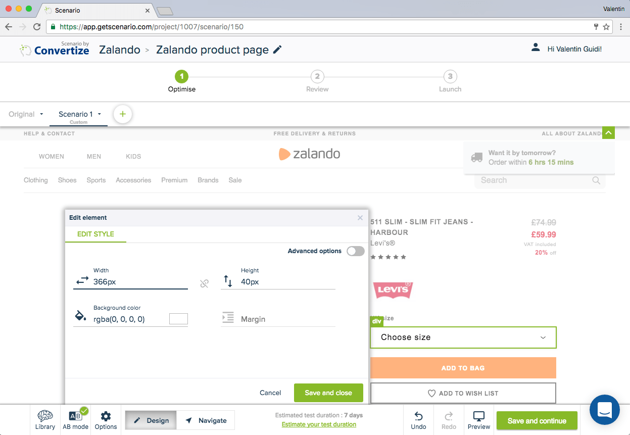
Editor (Tactic 306): For Zalando, we have used the “edit style” option to make changes to both the “choose size” filter and the “add to wishlist” Call-to-Action. We have simply changed the size of the “choose size” filter and removed the frame around the “add to wishlist” Call-to-Action in order to deemphasise it.
In order to help the user make a confident decision, we also introduced a “size guide” option replacing the previous static content “UK size”. When clicked on, users are shown the size guide page (the content already existed on Zalando we just added the link here using the “advanced HTML” option).
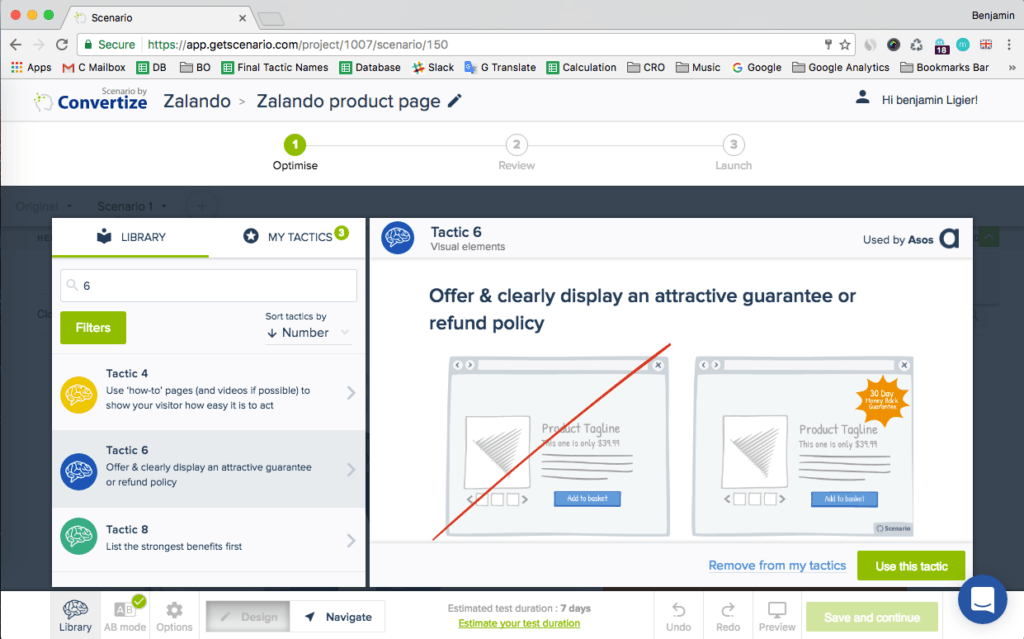
Tactic 6: Offer & clearly display an attractive guarantee or refund policy. By clearly offering an attractive guarantee or refund policy, customers won’t find the process of paying as difficult or negative as they know they are able to return the product and get their money back if they don’t like their purchase.
Modified page:
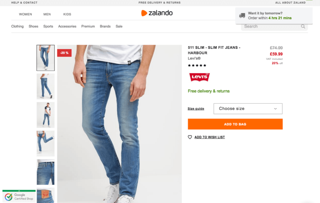
Urgency has been created on this page to encourage users to order as soon as possible. Product title and logo, filters and Call-to-Action have been reordered to improve hierarchy and readability.
A quick summary of the changes:
- Added an urgency effect with the Urgency SmartPlugin
- Emphasised the free delivery and returns
- Modified the CTAs to highlight the primary button
Try it yourself with a free 14-day trial
Now you've seen how easy it is to use Convertize,
why not give it a try with our free trial?
