John Lewis – the £1 billion online checkout
John Lewis – a quintessential British brand that has never failed to grow and adapt with the times. Their online store is hugely successful, with online sales almost tripling since 2011 and exceeding the annual £1billion mark back in 2014.
Well, they must be doing something right! I decided to check out their checkout (see what I did there…!) and see how much this process might have to do with their success or whether there were elements that weren’t so successful from the perspective of a Conversion Rate Expert such as myself. One thing I’ve learnt throughout my career is that there is always room for improvement where conversion rate optimisation is concerned…
The Overall Checkout Process
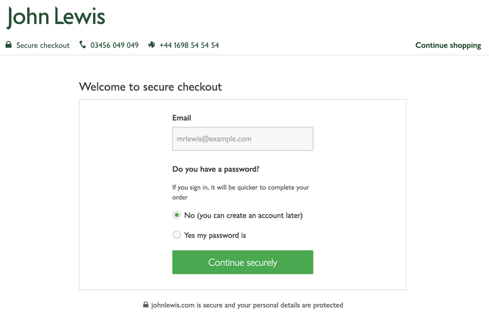
 They have a very clear display, without excessive menus or other distractions, that keeps the cognitive processing simple and easy – always important for conversion (thanks to the psychological principle “Cognitive Ease”).
 Online security can be the deciding factor when it comes to making an online sale. John Lewis have got it right here: on the initial checkout page there is reassurement of the site security 4 times! The instantly recognisable padlock icon followed by the words “secure checkout” are given pride of place at the top of the screen right underneath “John Lewis” and are present throughout the process. On this initial page there is also “Welcome to secure checkout”, “continue securely” and “ johnlewis.com is secure and your personal details are protected” also clearly displayed (this aids Need for Certainty).
 Next to this secure checkout confirmation they have two contact phone numbers. It’s great to provide a contact number or a live chat option during the checkout process incase visitors have last minute questions that could make the difference between actually converting or not. But why are there two different numbers showing? We can make an educated guess from the icons and the formatting that one is for UK customers and one for International customers but it isn’t particularly clear – especially if you might actually be an international customer who doesn’t recognise the UK dialling code etc.
John Lewis – the £1 billion online checkout
Click here to download a PDF copy of this article Save to read later or share with a colleague. On the top right there is the option to “continue shopping”. Whilst it might be understandable that someone will suddenly want to add an extra item to their basket before completing the checkout, in the majority of cases this clearly displayed option will just cause distraction and potential leaks. Perhaps they see this and suddenly remember something else they want to buy so they leave the checkout process to see if John Lewis have it – only they don’t. So then they decide to go on Amazon instead and actually, once they’re there, they just decide to make all their purchases on their site instead for ease. Once a customer has started the checkout process, it’s always preferable to keep them safely in the funnel until the process is completed.

 Speaking of funnels though… There is a nice clear presentation of the 3 steps required for completion of the purchase. Not only does this help customers visualise the process and see that it will be fairly quick, which will encourage them to continue on, but the Zeigarnik Effect means that we will also be more likely to complete a task we’ve started if it is made obvious to us that we are not yet at the end. This clearly displayed funnel will remind people that they’ve already invested time to arrive at this point and so will be subconsciously driven to follow the steps until the end.
The Login Page
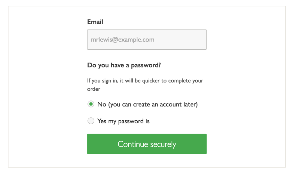
 Allowing visitors to checkout as a guest without forcing them to create an account straight away is always a good thing. In an online world where the ever-increasing desire for convenience and immediate gratification is King, something as small as forcing customers to fill out a registration form to create an account could be the nail in the conversion coffin. People also like the feel as though they are in control and have autonomy (this is the psychological principle “Autonomy Bias”) and so will appreciate being able to decide for themselves.
 Unfortunately though, the display is a little ambiguous here (thereby appealing to the Ambiguity Effect). Asking simply “Do you have a password?” may throw some people. Do they have a password? They don’t know – was one given to them the last time they shopped with John Lewis? Are they going to have to dig through old emails now? This is the potential thought process thrown up by this question. Much more straightforward would be to have two tabs that make it completely clear which path visitors should follows: “I have an account” and “I don’t have an account”. Then within those tabs they can either enter their login details or just their email (with perhaps a subtle Call-to-Action button that allows them the option of creating an account straight away or informs them they will have the option to do so after purchase).
The Delivery Page
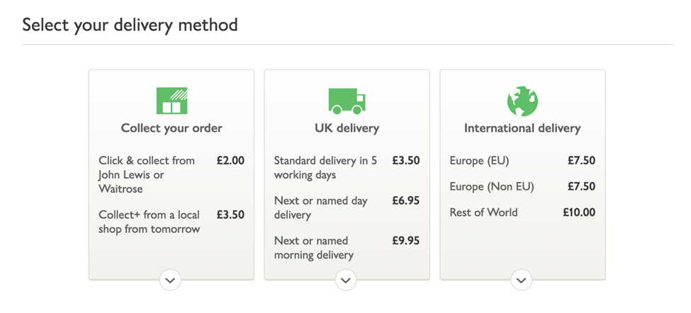
 It is always a good idea to use icons in addition to text. The brain will more automatically and immediately comprehend information portrayed through an image (Picture Superiority Effect). That extra ease of comprehension makes it more likely that people will continue on with the process. It also make the page more visually appealing.
 However, the first icon is not particularly clear. In fact, I can’t really see how it relates to collecting your order at all. Similarly, the second icon – whilst immediately relatable to the “delivery” element – doesn’t make it clear that it’s UK as opposed to international (clearly shown by the globe icon at the end).
 It’s great that they have so many different delivery options. Allowing people to choose the most suitable way for them to collect an item or have it delivered will certainly encourage continued conversion.
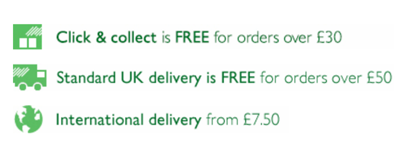
 If you’re spending less than £30 for click & collect or less than £50 for delivery, then there is no free option. Whilst they do remind people of this at the basket page, we are often all in a hurry and might not take note of the information. In any case I would expect a store as iconic and successful as John Lewis to offer at least one free delivery option as standard – even if that is just the click & collect. Why does it cost £2.00 to go into store and pick it up yourself? It would be interesting to know how many people drop out of the funnel at this point and whether it is due to the lack of a free delivery option for smaller purchases – an exit pop-up offering a free option for collection would be a worthwhile test.
The Review & Pay Page
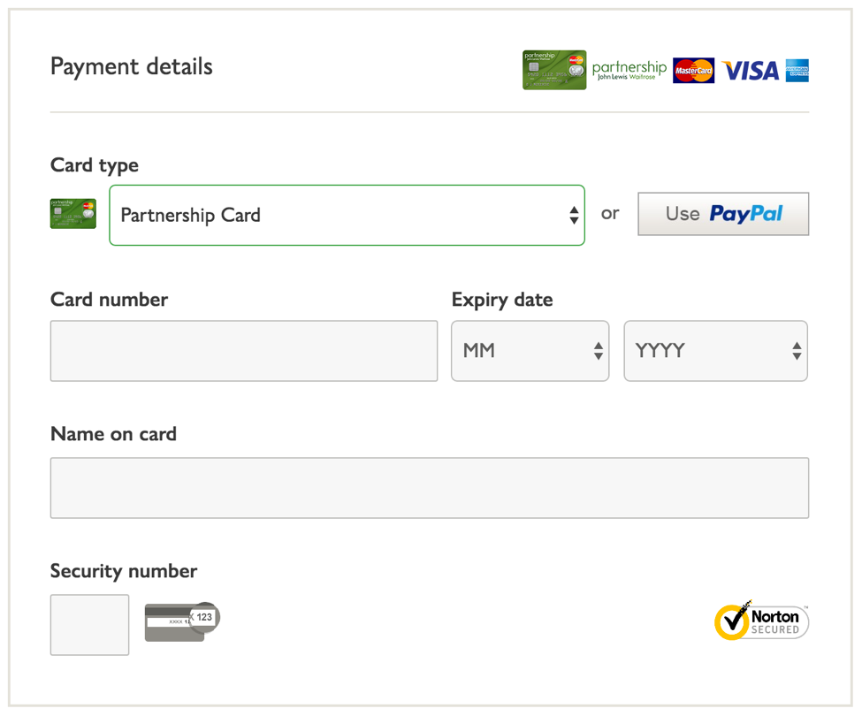
 Everything is clearly laid out on the payment screen. The cards you are able to use (including the John Lewis Partnership card) all have icons displayed. There is also a clear option to use Paypal as a payment method. This is an important option to include now because Paypal is the preferred online currency of many and not being able to use it could result in a serious loss in conversions – even at this late stage.
 Once again, there are multiple reassurance icons to remind people at this particular moment that John Lewis is a safe and secure site on which to shop (Need for Certainty).
 Although, the credit card information and billing address details would be better located at the end of the form after the order and product review. Although you don’t click on “pay & place my order” until the very end, entering your payment details feels as though you are paying and customers will prefer to do this act after reassuring themselves that all the details are correct.
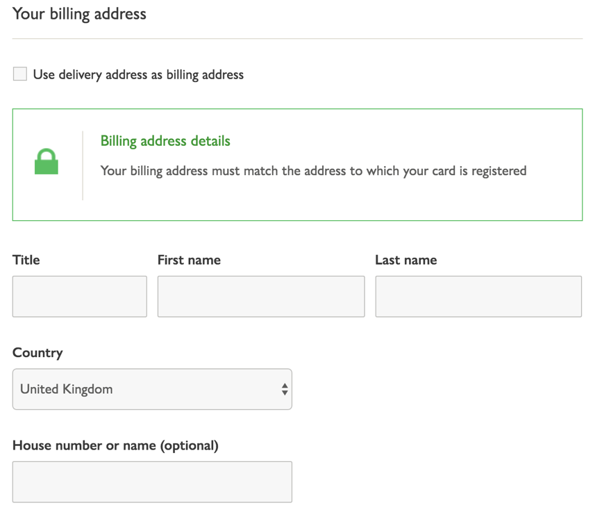
 This is quite a long page with a lot of information on it that can seem a little daunting after the easy previous steps. One area that could easily be trimmed down is by replacing the Billing Address form accompanied by the tickbox for “use delivery address as billing address” with simply a tickbox for if your billing address is different to your delivery address which, once clicked on, would open up the form (This aids Processing Fluency).

 A reminder of the delivery option chosen and the timeframe in which you can expect its arrival is a good thing to add in during the review. Accompanied by an option to quickly and easily upgrade to a different, more expensive, delivery option directly on the page is likely to result in some last minute decisions to get items delivered sooner, increasing the overall value of the sale.
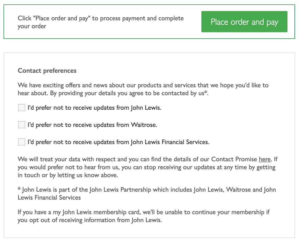
 John Lewis is being a bit sneaky by putting the “Contact preferences” options underneath the Call-to-Action for finalising purchase. The hope is obviously that people will ignore it completely and, as they are opt-OUT boxes, then they will automatically have more people to add to their mailing lists. The trouble with this is that some people will notice and will feel confused by the fact that there are more questions beyond the point of sale. Have they missed something? This distraction right at the final moment of conversion might not be worthwhile. It would perhaps be better placed underneath the confirmation of order on the next page.
In conclusion, it isn’t hard to see why John Lewis are so successful with online sales, even just from this small section of their site. Overall it is well designed with conversion in mind for most of the process. However, as I said to begin with, there is always room for improvement and if it were one of my clients I would suggest testing some tweaks to see whether an even more significant conversion rate could be obtained.
