Use Website Notifications To Get More Sales And Sign-Ups
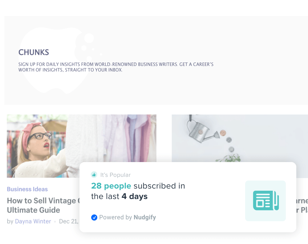
Instead of the familiar deluge of emails, pop-ups and display ads, new technology like website notifications has allowed marketers to deliver more personalised messages. Website notifications provide helpful information at key moments in the customer journey, pushing consumers towards the “buy” button.
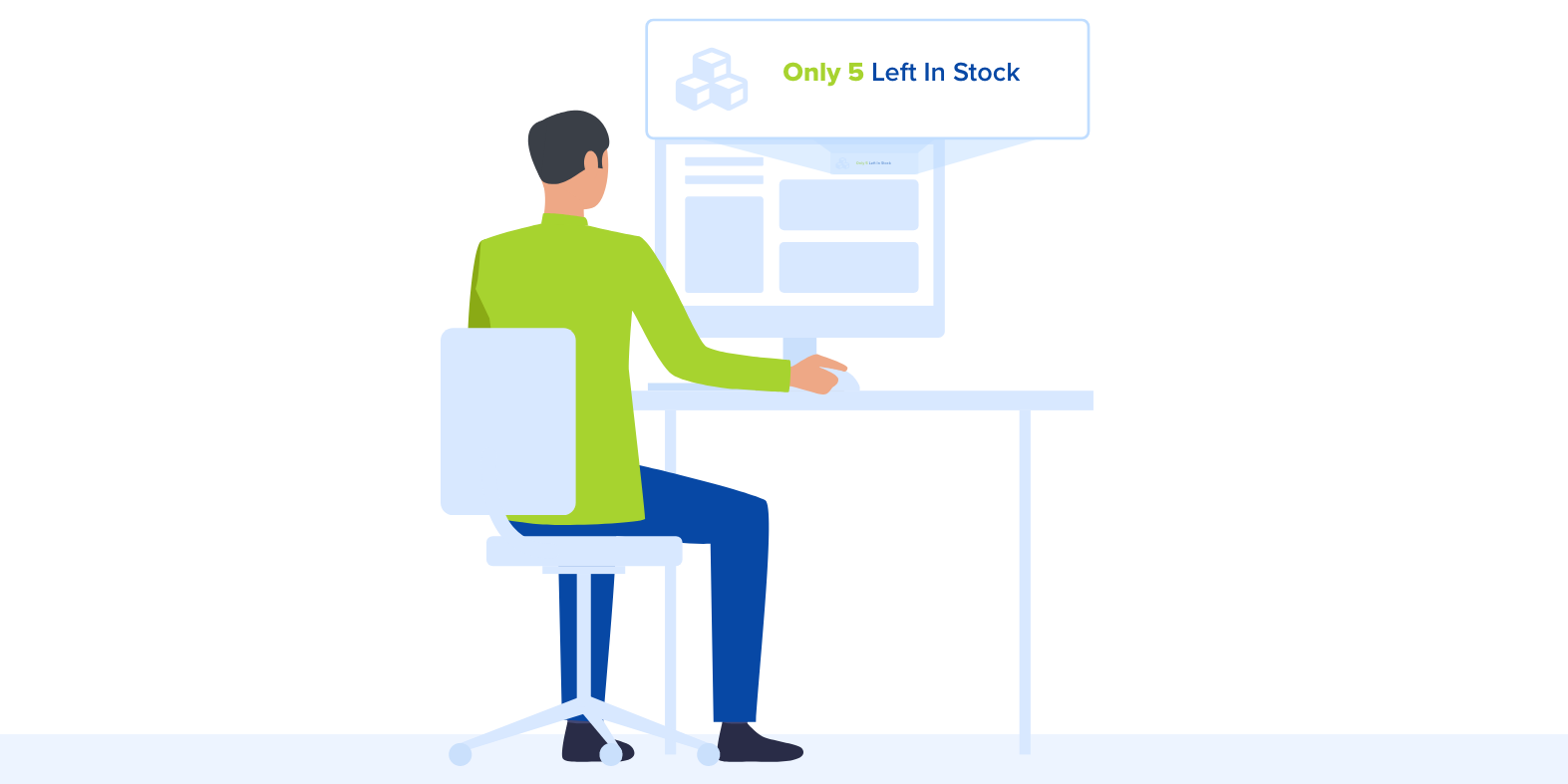
How To Use Website Notifications To Get More Sales And Sign-Ups
Why Notifications are a Key Marketing Channel
- Website Notifications VS Email Marketing
- Website Notifications VS Pop Ups
- Website Notifications VS Advertising
Internet users are flooded with information. Most of Google’s revenue is raised through advertising, and most of this gets ignored. Office workers receive an average of 121 emails a day, and less than a quarter of them are ever opened. Web notifications allow you to reach your audience in a different way.
Why Notifications are a Key Marketing Channel
Because they appear whilst a browser is visiting your site, website notifications do not need to apply the same sales tactics as ads or pop-ups. Instead, they give users helpful information and context. By recreating psychological effects such as Social Proof and FOMO, that would occur in a real shop, website notifications bring online stores to life. Like a well-organised shop display, notifications improve the online customer experience.
Website Notifications VS Email Marketing
The inbox is a hostile environment. Not only are emails unlikely to be seen, they are usually unwelcome. They are also likely to be forgotten almost immediately. Of the 300 Billion emails likely to be sent in 2020, nearly 20% will end up in the spam folder. A further 20% are not suitable for mobile internet and, of the remaining emails, less than 15% are likely to be read.
By contrast, website notifications only reach people who are interested in your products. Increasing your conversion rate, and the average order value for purchases on your site, is a cheaper and more customer-friendly way to grow your revenue.
Website Notifications vs Pop-ups
A pop-up can appear at any time, and they are usually associated with dodgy websites. They are designed to grab attention and change behaviour, causing people to experience reactance. They are also some of the least-trusted formats for businesses to use. Because of this, the average conversion rate for a pop ups is under 4%.
By contrast, website notifications are associated with more modern, trustworthy sites. They do not interrupt the browsing session and are unlikely to frustrate users.
Website Notifications vs Advertising
If you’re building a brand, and you want to grow fast, advertising may be your only option. Unfortunately, the return is low and you will have to think long-term to see the benefits. The average click-through rate for a display ad can be as low as 0.1%.
Notifications may not shout your brand as loudly, but they help you build your business by making your website more effective. Every customer you convert helps to build momentum for your brand, giving you a better long-term return.
Use Website Notifications To Get More Sales And Sign-Ups
Using website notifications well allows you to communicate with your customers and recreates the tangibility of real-world shopping. If you’ve ever wished your online store had a charming shop assistant, this is your solution.
Step 1. Choose an App
Choosing the right app for your Social Proof and FOMO messages is the first step. You need an app that can increase your conversion rate and improve your customer experience at the same time.
Step 2. Work on Your Images
Images are a crucial part of marketing. Over half of marketers say they use images in 100% of their content. The reason is simple: images make it easier to communicate. Psychologists have identified a “picture superiority effect” in which both memory and recognition are improved by visual (rather than textual) communication.
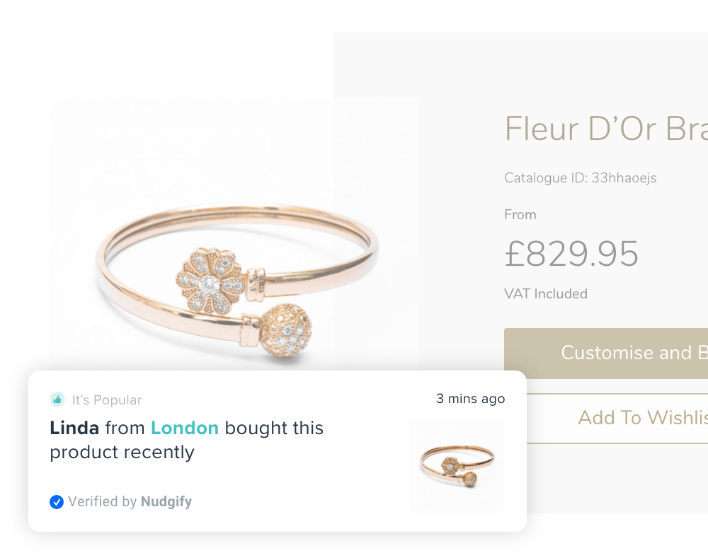
Every notification you display should incorporate an image that helps users to interpret it quickly. These notifications are less likely to be ignored, reduce distraction from the product and are more likely to provoke an emotional response.
Step 3. Create Some Urgency
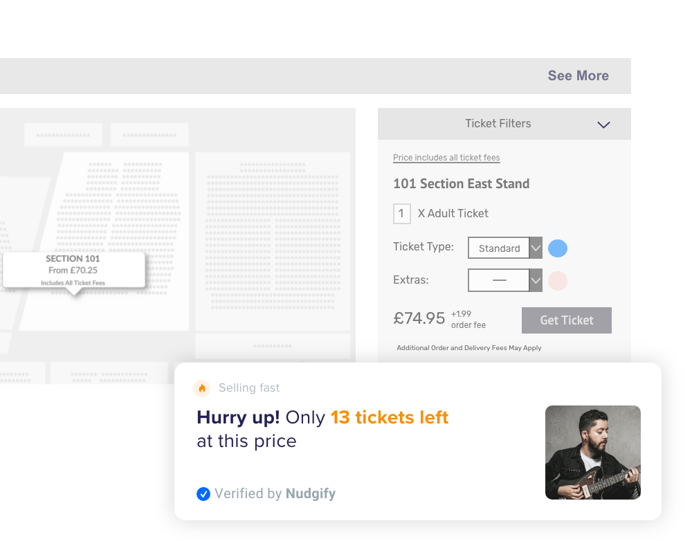
Urgency is a tried-and-tested retail strategy: applying a time condition to an offer allows you to prevent a potential customer from delaying their purchase. The effect of a time condition acts in both rational and emotional ways. Customers will consciously modify their behaviour to take advantage of a limited-time offer, but they will also experience an emotional pull as a result of the potential for missing out. A website notification plugin can act as both a Social Proof and FOMO app.
Step 4. Make Your Offers Personal
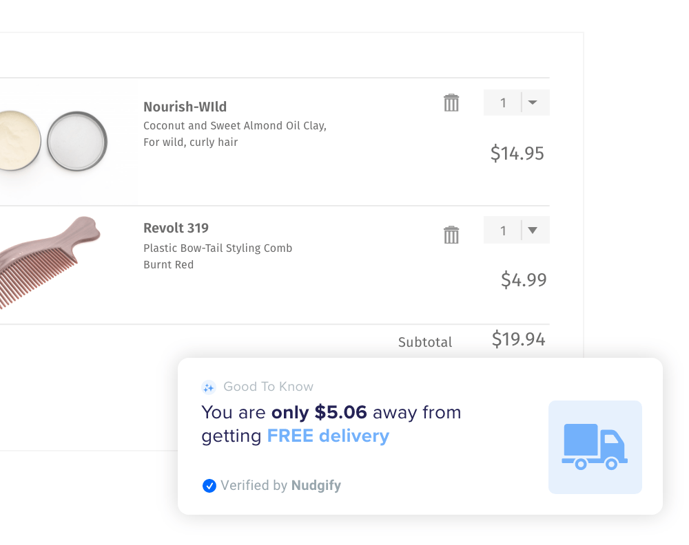
Personalisation has become a popular marketing buzzword. Over 95% of marketers agree that personalising offers and communications improves customer relationships. The emotional impact of an offer is magnified when it is specific to the browser and their browsing session.
Step 5. Get Comfortable With Social Proof
Since the publication of books like Cialdini’s Influence, marketers have become increasingly aware of the social effects that guide consumer choices. Effects such as Social Proof and FOMO lead people to imitate the example of their peers.
By showing users what previous customers have bought, you build up trust in those choices. You also make the potential for missing out on those choices more significant.
Building Your Business With Website Notifications
Website notifications provide web marketers with a way of communicating directly with consumers. They reach only the most relevant targets and contact them at the most significant stage of the purchase process. Combined with effective copywriting and pricing strategies, web notifications are an efficient tool for increasing conversions.

